How to make a plot on an experimental figure

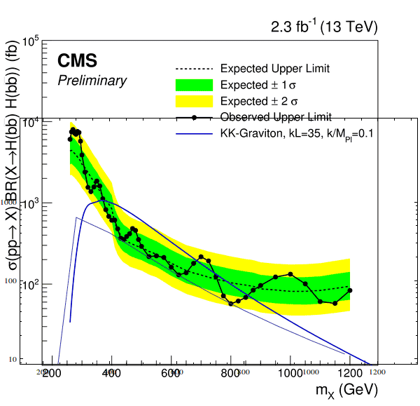
In summary, the conversation is about adding a ListPlot graph to an existing experimental figure. The person has tried using Mathematica but was not able to get the graph to align correctly with the theoretical line in the figure. They are looking for help in finding a tool that can analyze the existing image and determine the coordinates of the axes in order to add the graph accurately.
  • #1
Safinaz
259
8
Hi all,

What is the tool which can add my Listplot graph like:
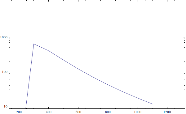
plot.png


to an experimental figure as following: such that the (x-y) axes coincidence in both figure and graph:
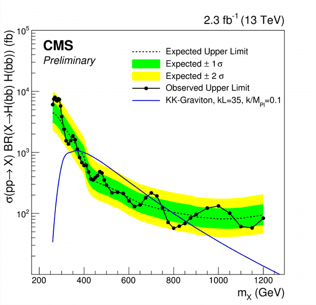
CMS-PAS-HIG-16-002_Figure_007.png

Actually I tried Mathematica as:

Code:
data27 = Import["~/Events/scan.dat"];
idata27 = Table[{data27[[i, 2]], data27[[i, 3]]*10^3}, {i, 1,Length[data27]}];
sh = Show[
  ListLogPlot[idata27, Axes -> True, Frame -> True, Joined -> True],
  PlotRange -> {{150, 1300}, {Log[10], Log[10000]}}, ImageSize -> 600]

mm = Import["~/Desktop/search/CMS-PAS-HIG-16-002_Figure_007.png",
  ImageSize -> 600]

Overlay[{mm, sh}, Alignment -> {-0.4, -0.6}]

But i ended up by:

scanMG.png


So any help to got my graph JUST AS the blue theoretical line appears in the figure ?

Best ..
 

Attachments

  • Figure.png
    Figure.png
    20.4 KB · Views: 441
  • scanMG.png
    scanMG.png
    26.1 KB · Views: 480
Physics news on Phys.org
  • #2
You'll need ideally the ROOT file used to make the CMS plot, or alternatively some program that can analyze the existing image and figure out where the axes are. There are tools that can do that, but I don't know them. Once you have that you can scale your data to figure out the coordinates of your lines, and add those to the image.
 
  • Like
Likes Safinaz

Related to How to make a plot on an experimental figure

1. How do I label the axes on my plot?

To label the axes on your plot, you can use the "xlabel" and "ylabel" functions in your plotting software. Simply input the desired label as a string within the parentheses of the function.

2. How do I change the color or style of my plot?

To change the color or style of your plot, you can use the "color" and "linestyle" parameters in your plotting software. Simply specify the desired color or style within the parentheses of the function.

3. Can I add a legend to my plot?

Yes, you can add a legend to your plot by using the "legend" function in your plotting software. Simply specify the labels for each data series within the parentheses of the function.

4. How do I add error bars to my plot?

To add error bars to your plot, you can use the "errorbar" function in your plotting software. Specify the x and y values, as well as the size of the error bars, within the parentheses of the function.

5. Can I customize the font and size of my plot's title and labels?

Yes, you can customize the font and size of your plot's title and labels by using the "title" and "set" functions in your plotting software. Specify the desired font and size within the parentheses of the function.

Similar threads

  • MATLAB, Maple, Mathematica, LaTeX
Replies
2
Views
891
Back
Top