Alphabetic Design Elements - or: I've had too much coffee!

  • Thread starter DaveC426913
  • Start date
In summary, "Alphabetic Design Elements - or: I've had too much coffee!" explores the influence of typography and letterforms in design, emphasizing how they can evoke emotions and convey messages effectively. The author reflects on the energetic impact of caffeine, paralleling it with the dynamic qualities of letters in design, suggesting that both can enhance creativity and communication in various contexts.
  • #1
DaveC426913
Gold Member
22,989
6,665
This is what happens when I have coffee after 2PM. (I am not a coffee-drinker.) Did this in my head between 12 and 1AM while staring at the ceiling of my bedroom.

I've uniquely defined the letters of the alphabet with a maximum of 14 design elements.
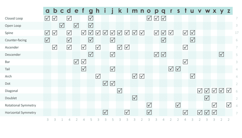
1703089924289.png

I chose Century Gothic as a typeface with the simplest, most basic, elemental styles (sans serif and no funky tails on 'a's). I cheated with 'u'. It doesn't actually have a spine in CG, but, in my world 'u' is best defined having a spine.

I had the biggest struggle with v,x and z. Element-wise, they have a lot of overlap. I finally had to add two "Symmetry" Elements just for these cases, (which, as you will see below, is a very inefficient use of parameters).

Some are sort of default characters. 'c' requires only one element type.

Some are on the long tail of the frequency curve, with 'g' having the most elements (5). Now, that is a little over-specified - g is already uniquely-defined without needing to specify that it is counter-facing. But since I had to add 'Counter-facing' to distinguish p from d and q from b, it just incidentally applies to g. Similar thing happens for horizontal symmetry with 'i' and 'l'.
 
Last edited:
  • Like
Likes Charles Link
Physics news on Phys.org
  • #2
1AM till 2AM14 element types to define 26 unique characters is not great, really. It takes .54 element-types per character, which is really wasteful.If we take a side-trip into abstracted optimization, the theoretical minimum element-types is 5. 2^5 = 32 which is enough in theory to uniqiuely define every letter:
1703090145439.png


(though they wouldn't appear in order like a binary sequence graph):
1703091133743.png
This solution is highly theoretical because it is going to be very difficult to find a mere 5 design elements that, in combination, uniquely define each of the 26 letters.

Glossary: Element
An element type has a loose set of conditions:
  • It must be a common element (i.e. 2 or more characters require it; so "x-shaped" doesn't qualify as a element type)
  • It must be a simple, basic construction element ('diagonal' is a basic element; 'shaped like a p' applies to both p and b but doesnt qualify as simple/basic).
5 elements to define 26 characters is pretty good. That's .19 element-types per character.

But even 2^5 is a little high for the theoretical minimum. (As long as we have the ability to define 32 characters uniquely, we will always wonder: what do those extra 6 possible characters look like?**)Technically, we really only need 4.7 element types (2^4.7 = 26). That gives .18 - the best possible ratio of elements to characters.

Is it possible to have a fractional element type? I think it is. Some elements are subsets of others, so they don't have complete independent range.

Ascender/descender are mutually exclusive (well, not by rule, but by there being no such character). It might be possible to formulate a sub-element type. And there's a lot of overlap between 'tail' 'arch' and 'open loop'.

More work to be done...**

1703091582609.png

https://en.wikipedia.org/wiki/On_Beyond_Zebra!
(definitely more than six!)
1703091757974.png
 
Last edited:
  • #3
Look at the way Chinese characters are entered on a western keyboard.
https://en.wikipedia.org/wiki/Wubi_method

In August 1983, exactly 40 years ago, a Chinese engineer named Wang Yongmin developed the first popular way to input Chinese characters into a computer: Wubi. He did it by breaking down a Chinese character into different strokes and assigning several strokes to each letter on the QWERTY keyboard.
https://www.technologyreview.com/2023/08/23/1078274/fascinating-evolution-typing-chinese-characters/
 
  • Like
Likes DaveC426913

FAQ: Alphabetic Design Elements - or: I've had too much coffee!

What is "Alphabetic Design Elements - or: I've had too much coffee!" about?

"Alphabetic Design Elements - or: I've had too much coffee!" is a conceptual exploration of how typography and design elements can be creatively manipulated, often in a whimsical or exaggerated manner, to produce unique visual effects. The title suggests a playful approach, possibly influenced by the heightened energy and creativity that can come from consuming too much coffee.

How does coffee influence the design process described in this concept?

The reference to having "too much coffee" in the title implies that the design process might be more spontaneous, energetic, and possibly chaotic. Coffee can heighten alertness and creativity, leading designers to experiment more boldly with alphabetic elements and push the boundaries of conventional typography and layout.

What are some examples of alphabetic design elements?

Alphabetic design elements include any visual components derived from the shapes and forms of letters and characters. Examples might include typographic illustrations, where letters are used to create images; custom fonts with exaggerated features; or dynamic layouts where text flows in unconventional patterns or interacts with other design elements in unexpected ways.

Why is the concept of alphabetic design elements important in modern design?

Alphabetic design elements are crucial in modern design because they blend functionality with creativity. Typography is not just about readability; it's also a powerful tool for visual communication. By experimenting with alphabetic elements, designers can create more engaging, memorable, and impactful designs that capture the viewer's attention and convey messages more effectively.

Can beginners experiment with alphabetic design elements, or is it only for experienced designers?

Beginners can definitely experiment with alphabetic design elements. While experience can help in understanding the nuances of typography and design principles, creativity and experimentation are accessible to everyone. Starting with simple exercises, like altering letter shapes or creating typographic compositions, can help beginners develop their skills and confidence in using alphabetic design elements.

Similar threads

Replies
5
Views
2K
Replies
1
Views
1K
Replies
7
Views
2K
Replies
1
Views
3K
Replies
2
Views
8K
Replies
1
Views
2K
Replies
1
Views
3K
Replies
5
Views
3K
Back
Top