Animating 2D Heat Map with Varying Time Intervals

In summary: FuncAnimation(plt.figure(), animate, interval=1, frames=max_iterations, repeat=False)anim.save("heat.gif",writer='pillow')
  • #1
schniefen
178
4
TL;DR Summary
how to animate 2d heat map
Consider the following heat map:
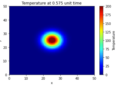
Python:
from scipy import special
import numpy as np
import matplotlib.pyplot as plt
 
u0=200
r0x=25
r0y=25
rmax=2.5
alpha=2
t=0.575
 
y, x = np.meshgrid(np.linspace(0, 50, 100), np.linspace(0, 50, 100))
r=np.sqrt((x-r0x)**2+(y-r0y)**2)
z=u0*(special.erf((rmax-r)/(4*alpha*t))-special.erf((-rmax-r)/(4*alpha*t)))
 
plt.pcolormesh(x, y, z, cmap='jet')
plt.xlim(x.min(), x.max())
plt.ylim(y.min(), y.max())
plt.xlabel('x')
plt.ylabel('y')
plt.title(f'Temperature at {t} unit time')
cbar=plt.colorbar()
cbar.set_label('Temperature')
plt.clim(0,200)

Screen Shot 2022-11-20 at 22.57.27.png

I would now like to animate this heat map for different t, say t=np.linspace(0.0001,3,200). My attempt so far is the following:

Python:
import numpy as np
from matplotlib import pyplot as plt
from matplotlib import animation
 
u0=200
r0x=25
r0y=25
rmax=2.5
alpha=2
 
def pulse_maker(x,y,t):
    x,y,t =np.meshgrid(x,y,t)
    r=np.sqrt((x-r0x)**2+(y-r0y)**2)
    return u0*(special.erf((rmax-r)/np.sqrt(4*alpha*t))-special.erf((-rmax-r)/np.sqrt(4*alpha*t)))
 
def plot_pulse(xvals, yvals, pulse, t, i):
    plt.clf()
    plt.title(f"Temperature at t = {t[I]:.2f}")
    plt.xlabel("x")
    plt.ylabel("y")
    plt.xlim(xvals.min(), xvals.max())
    plt.ylim(yvals.min(), yvals.max())
    plt.pcolormesh(xvals, yvals, pulse[I], cmap='jet')
    cbar=plt.colorbar()
    cbar.set_label('Temperature')
    plt.clim(0,200)
    return plt[/I][/I]
 
[I][I]def animate(i):
    plt = plot_pulse(xrange,yrange, pulse, times, i);[/I][/I]
 
[I][I]max_iterations = 200
times = np.linspace(0.0001, 3, max_iterations)
xrange = np.linspace(0,50, max_iterations)
yrange = np.linspace(0,50, max_iterations)
pulse = pulse_maker(x=xrange, y=yrange, t=times)
anim = animation.FuncAnimation(plt.figure(), animate, interval=1,
                               frames=max_iterations, repeat=False)
anim.save("heat.gif",writer='pillow')

However, there is something wrong with this animation if you run it. It does not give back the still image as above, rather the heat is very off-centered, although I have used the same initial values. Grateful for any feedback.
 
Technology news on Phys.org
  • #2
The issue with your code is that you are recreating the plot each time with new data, rather than updating the plot with the new data. To update the plot with the new data, you need to create the plot once, and then update it in the animation loop. This can be done by creating a figure outside of the animation loop, and adding the plot to the figure in the animation loop.For example, try changing your code to this:import numpy as npfrom matplotlib import pyplot as pltfrom matplotlib import animation u0=200r0x=25r0y=25rmax=2.5alpha=2 def pulse_maker(x,y,t): x,y,t =np.meshgrid(x,y,t) r=np.sqrt((x-r0x)**2+(y-r0y)**2) return u0*(special.erf((rmax-r)/np.sqrt(4*alpha*t))-special.erf((-rmax-r)/np.sqrt(4*alpha*t))) def plot_pulse(xvals, yvals, pulse, t, i): plt.clf() plt.title(f"Temperature at t = {t:.2f}") plt.xlabel("x") plt.ylabel("y") plt.xlim(xvals.min(), xvals.max()) plt.ylim(yvals.min(), yvals.max()) plt.pcolormesh(xvals, yvals, pulse, cmap='jet') cbar=plt.colorbar() cbar.set_label('Temperature') plt.clim(0,200) return plt max_iterations = 200times = np.linspace(0.0001, 3, max_iterations)xrange = np.linspace(0,50, max_iterations)yrange = np.linspace(0,50, max_iterations)pulse = pulse
 

FAQ: Animating 2D Heat Map with Varying Time Intervals

What is a 2D heat map and how does it differ from a traditional map?

A 2D heat map is a graphical representation of data where values are represented using different colors or shades to indicate varying levels of intensity. This differs from a traditional map which typically shows geographical features and boundaries.

How is time interval variation incorporated into the animation of a 2D heat map?

In order to animate a 2D heat map with varying time intervals, the data must be organized into a sequence of frames. Each frame represents a specific time interval and the corresponding data values are displayed using the appropriate color or shade on the map. As the animation progresses, the frames are played in sequence, giving the illusion of change over time.

What are the benefits of animating a 2D heat map with varying time intervals?

Animating a 2D heat map with varying time intervals allows for a more dynamic and interactive representation of data. It can help to highlight patterns and trends over time, making it easier to analyze and understand complex datasets. It also adds a visual element to the data, making it more engaging and easier to communicate to others.

What types of data are best suited for animating a 2D heat map with varying time intervals?

2D heat maps with varying time intervals are best suited for representing data that changes over time, such as population growth, weather patterns, or stock market trends. It can also be useful for tracking the movement of objects or events over time, such as traffic patterns or disease outbreaks.

Are there any limitations to animating a 2D heat map with varying time intervals?

One limitation to animating a 2D heat map with varying time intervals is the potential for data overload. If there are too many time intervals or too much data, the animation can become cluttered and difficult to interpret. Additionally, the accuracy of the animation may be limited by the resolution of the data and the speed of the animation.

Similar threads

Replies
1
Views
1K
Back
Top