Drawing the Graph: Analyzing Solutions and Questions

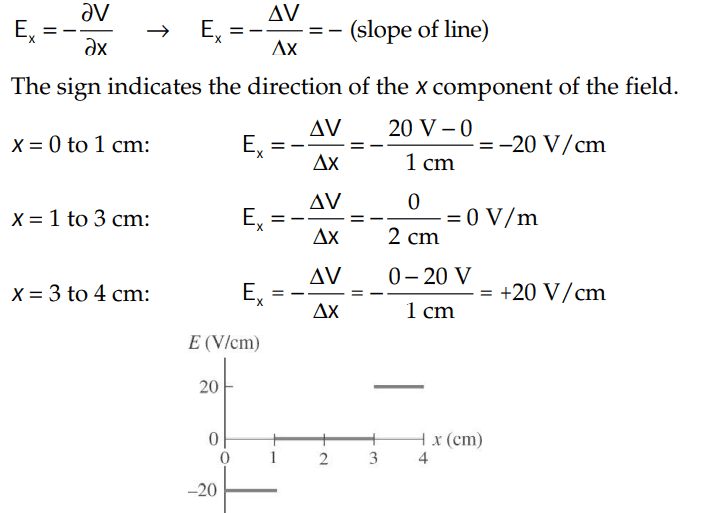
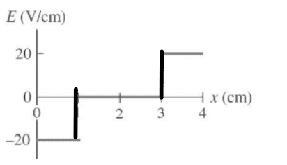
In summary, the electric field is discontinuous at x = 1 cm and x = 3 cm and is plotted without vertical lines to accurately represent the function's behavior. Drawing vertical lines would imply that the electric field has values in between the discontinuities, which it does not.
  • #1
member 731016
Homework Statement
Please see below
Relevant Equations
Please see below
For this problem,
1673315233100.png
,
The solutions is,
1673315261826.png

However, why did they not draw vertical lines for the graph like this:
1673315340737.png
?

Thank you!
 
Physics news on Phys.org
  • #2
Callumnc1 said:
However, why did they not draw vertical lines for the graph like this:
Because the electric field is discontinuous at x = 1 cm and x = 3 cm and that is how discontinuous functions are plotted. Drawing a line as you suggest implies that the electric field has all the in-between values which it doesn't.
 
  • Like
Likes member 731016
  • #3
kuruman said:
Because the electric field is discontinuous at x = 1 cm and x = 3 cm and that is how discontinuous functions are plotted. Drawing a line as you suggest implies that the electric field has all the in-between values which it doesn't.
Got it, thank you @kuruman !
 

FAQ: Drawing the Graph: Analyzing Solutions and Questions

What is the primary goal of drawing a graph in the context of analyzing solutions?

The primary goal of drawing a graph in the context of analyzing solutions is to visually represent data or mathematical relationships, making it easier to identify patterns, trends, and insights that may not be immediately apparent from raw data alone. This visual representation helps in understanding the behavior of variables and the interactions between them, facilitating more informed decision-making and problem-solving.

How do you determine which type of graph is most appropriate for your data?

The type of graph most appropriate for your data depends on the nature of the data and the specific insights you wish to gain. For example, line graphs are ideal for showing trends over time, bar graphs are useful for comparing different categories, scatter plots are great for illustrating relationships between two variables, and pie charts are effective for displaying proportions. Understanding the characteristics of your data and the questions you aim to answer will guide you in selecting the most suitable graph type.

What are common pitfalls to avoid when drawing and interpreting graphs?

Common pitfalls when drawing and interpreting graphs include using inappropriate graph types, mislabeling axes, not providing units of measurement, ignoring data outliers, and failing to use a consistent scale. Additionally, it's important to avoid cherry-picking data to support a preconceived conclusion, as this can lead to misleading interpretations. Ensuring clarity, accuracy, and honesty in your graphical representations is crucial for reliable analysis.

How can graphs be used to identify potential solutions to a problem?

Graphs can be used to identify potential solutions to a problem by highlighting trends, correlations, and anomalies in the data. For instance, a graph showing a clear upward trend in sales after implementing a new marketing strategy can suggest that the strategy is effective. Similarly, a scatter plot revealing a strong correlation between two variables can indicate a potential causal relationship that can be further investigated. By providing a visual summary of complex data, graphs help pinpoint areas that warrant further exploration and action.

What tools and software are commonly used for drawing graphs and analyzing data?

Common tools and software used for drawing graphs and analyzing data include Microsoft Excel, Google Sheets, R, Python (with libraries such as Matplotlib, Seaborn, and Plotly), Tableau, and MATLAB. These tools offer a range of functionalities for creating various types of graphs, performing statistical analysis, and generating interactive visualizations. The choice of tool often depends on the specific requirements of the analysis, the complexity of the data, and the user's proficiency with the software.

Back
Top