Experiment - how temperature changes along a tube, using heaters

In summary, a student is seeking help with plotting heat maps using data gathered from an experiment. The experiment involved a long tube with black-painted lightbulbs as heaters and temperature sensors placed at different locations to measure changes in temperature. The student has already plotted individual temperature graphs for each sensor and needs to create a 2D+time or 3D heatmap using OriginPro software. However, they are unsure how to specify the position of each sensor and are seeking recommendations. The student also provides information about the tube's orientation, dimensions, and air flow rate. In addition, there is a conversation with another user offering suggestions for creating the heat map and discussing the precision of the experiment.
  • #1
Rezex124
13
17
Thread moved from the technical forums to the schoolwork forums
TL;DR Summary: Help needed with plotting heat maps, using data we gathered in an experiment.

Hello,

so I'm having problems with analysing data, which we gathered from an experiment we did in class. This is meant as a type of non-guided experiments class, where we are just given an initial problem, with no instructions.

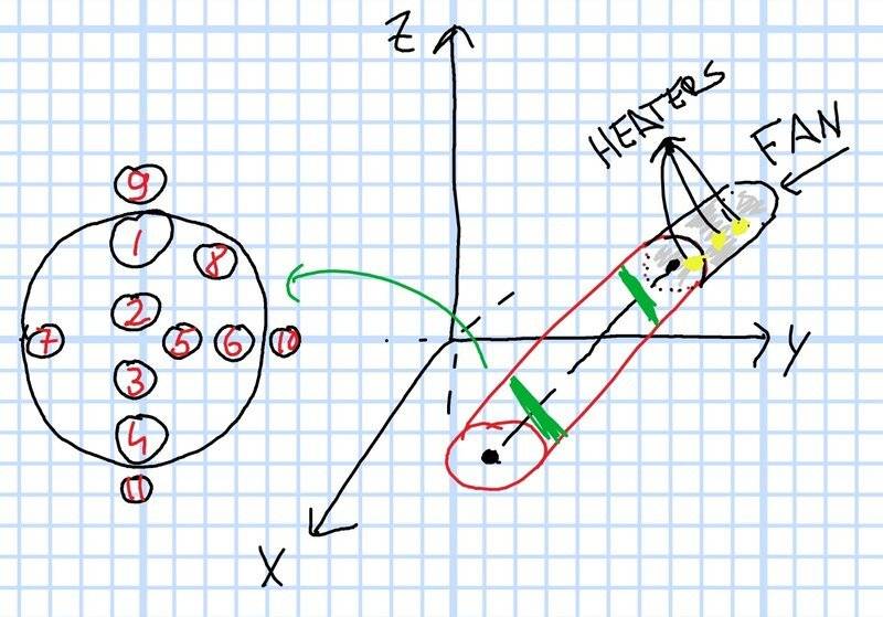
This weeks experiment went like this : We had a long tube (hollow cylinder), in which we placed some black-painted lightbulbs to use as heaters. Using a fan, we accomplished that the hot air travelled across the length of the tube. Using temperature sensors we measured change in temperature at certain points (green on picture). Sensors at both locations were in a configuration as shown on the left side of the picture.
Screenshot_2022-12-12-21-06-58-562_2.jpeg


We chose these locations for sensors to determine how temperature changes:

  • Along x axis (length of tube),
  • Along y axis (radius of tube at same height),
  • Along z axis (height of tube),
  • And how much heat escapes through the tube

We did the whole experiment, and recorded the data as needed. The professor said that we need to gather and sync the data and plot some graphs. I already plotted how temperature changes in an individual sensor over time (T(t) graphs for every sensor), but I still need to draw a 2D+time heat map AND/OR 3D heatmap, which we never mentioned or did before.

We were instructed to use OriginPro software for plotting but I can't find the heatmap option anywhere.
But even if there were, I can't make sense of how to specify at which IRL position was which sensor if that makes sense.

Does anyone have any recommendations?

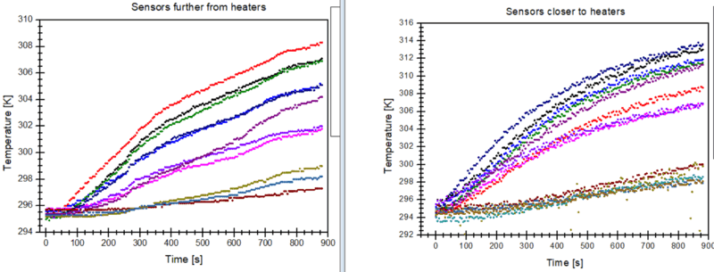
Also, here are T(t) graphs, if it helps.
Screenshot (705).png


Thanks in advance.
 
Physics news on Phys.org
  • #2
You are missing important information.
1. Is the tube horizontal? if not, what is its angle of inclination?
2. What is the diameter of the tube?
3. At what axial locations are the sensor banks relative to the axial location of the heater bank?
4. What is the flow rate of air down the tube?
 
  • Like
Likes Rezex124
  • #3
Chestermiller said:
You are missing important information.
1. Is the tube horizontal? if not, what is its angle of inclination?
2. What is the diameter of the tube?
3. At what axial locations are the sensor banks relative to the axial location of the heater bank?
4. What is the flow rate of air down the tube?
Ah yes sorry. I have the information but I seemed to forget to write it here.

1. The tube is horizontal. No inclination.
2. Diameter of the tube is (15.0±0.1)cm, its length is (2.50±0.05)m
3. The first batch of sensors are about 5cm away from the sensors, the second batch are about 1.5m away (if I understood what you meant correctly)
4. Flow rate of air down the tube is 120 m^3 / h, or about 0.033 m^3/s
 
  • #4
A flow rate of 33.3 L/s is the same as 33333 cc/s. With a cross sectional area (15 cm diameter) of 176.7 cm^2, that corresponds to an axial flow velocity of 189 cm/s = 1.89 m/s. So the mean residence time up to the further-away sensors is 1.5/1.89 = 0.8 sec. Are you sure that those times on your time axis are seconds and not milli-seconds?

The entering density of the air (from the ideal gas law) is ##\frac{PM}{RT}=\frac{(1)(29)}{(0.08205)(298}=1.19\ gm/L##. So the mass flow rate is 1.19 x 33.3 = 39.5 gm/s. We can use this to predict the average temperature rise of the air. What is the total power applied to the light bulbs?
 
  • #5
Hi @Rezex124. A few thoughts which might help...

I’ve no idea how you could do 3D heat map. But you could give a series of 2D heat maps at different times (e.g. at 100s, 400s and 800s) for each bank of sensors.

By 2D heat map I mean a colour-coded diagram, maybe a bit like this: https://i.stack.imgur.com/Wwlid.png. (Instead of latitude and longitude, you would have the zy coordinates of each sensor.)

You might have to produce these by drawing a set of numbered circles and colouring them in according to a colour-code for the temperature. I doubt you will find a tool to do it – but you could do it manually with simple drawing software.

I'm guessing what is required and what is acceptable. You might find it useful to first check if this sort of approach is OK with your teacher.

Other thoughts:

I don’t know what ‘IRL’ stands for.

Your existing graphs need to include a key showing which sensor corresponds to which coloured line.

Do you really mean the tube’s length was “(2.50±0.05)m”? Plus or minus 5cm is not a very impressive precision!
 
  • #6
Why stop at 900 seconds, looks like steady state is not achieved. Is the experiment aimed at the "startup transient" or at the steady state?
 
  • #7
Steve4Physics said:
I don’t know what ‘IRL’ stands for.
Ireland. Not sure of the context, though.
 
  • #8
"IRL" Probably referring to the common abbreviation used among youtubers "In real life"! Like when they play chess over the board for videos, they say it's harder IRL (as opposed to online)
 
  • Like
Likes Steve4Physics
  • #9
Thanks for all the replies,

first of all, IRL means In Real Life :)

Chestermiller said:
We can use this to predict the average temperature rise of the air. What is the total power applied to the light bulbs?

We used 8x25W (connected in parallel) lightbulbs so 200W combined.

Chestermiller said:
Are you sure that those times on your time axis are seconds and not milli-seconds?

gmax137 said:
Why stop at 900 seconds, looks like steady state is not achieved. Is the experiment aimed at the "startup transient" or at the steady state?

I'm sure that the x (time) axis is in seconds, seeing how the experiment went on for about 15minutes. We stopped there because we ran out of time assigned to the class, otherwise we would capture the whole spectrum, including the steady state. Also I made some mistakes in giving the measurements: I meant the tube has a radius (not diameter) of 15cm, and the tubes length, which was meant to be (2.500±0.005)m. This was measured with a normal band-meter, with systematic error of 1mm, but I added a few mm because of random errors. My bad.

Steve4Physics said:
Your existing graphs need to include a key showing which sensor corresponds to which coloured line.

Thanks for the reminder, I'm happy to say that the existing graphs already do have a legend and corresponding labels for the colours, I just cut them out of the picture to make the graphs themselves bigger (for better quality picture).
Steve4Physics said:
I’ve no idea how you could do 3D heat map. But you could give a series of 2D heat maps at different times (e.g. at 100s, 400s and 800s) for each bank of sensors.

By 2D heat map I mean a colour-coded diagram, maybe a bit like this: https://i.stack.imgur.com/Wwlid.png. (Instead of latitude and longitude, you would have the zy coordinates of each sensor.)

I also don't have any idea how I would go about a 3D heat map, so I thought of doing the 2D at different times. The way I imagined this was to make this colour coded diagram at every point in time we gathered the measurements, and then have an animation or a slider to show the changes in colour (temperature) over time.
Is this at all possible with a software or some other tool? (this idea does not seem kind at all to do it manually)
 
  • #10
OK. It looks like the thermal inertia of the tubing is slowing the temperature response. What is the tubing made of, and what is the ID and OD of the tubing?
 
  • #11
Chestermiller said:
OK. It looks like the thermal inertia of the tubing is slowing the temperature response. What is the tubing made of, and what is the ID and OD of the tubing?
The tube was made from some kind of plastic. Not sure which. It wasn't thick plastic, so the difference between ID and OD isn't much.
I didn't get specific measurements (and I don't have access to the tube anymore), but if I had to assess the value from memory, it would be around (2 - 4) mm
 
  • #12
My calculations indicate that the internal volume of the tube is about 177 L, and with a mass density of 1.19 gm/L for the air, the mass holdup of air in the tube is 211 gm. This compares with a mass of about 10 kg = 10,000 gm for the plastic tubing. So, during the experiment, the thermal inertia of the tubing is going to be very important. The time scale for the temperature response is an indication that a large fraction of the energy from the heaters is going into heating the tubing. For example, if we assume that all the heat goes into the tubing during 900 seconds, we would estimate a temperature rise of about 18 C, which is crudely consistent with the observed temperature rises. Of course, at long times, after to tubing comes to steady state, most of the energy from the heaters will exit with the air. The observed steady state temperature of the exit air can be used to refine the estimate of the air flow rate.
 
  • #13
If, at a given cross section and time, temperature is going to be roughly radially symmetric, and sensors 2,3, and 5, which are closer to the axis, should all be approximately the same temperature, and higher than temperatures of sensors 1,4.5,7,8, which are closer to the wall (and cooler). You should calculate the radial locations of 2,3,5, average their temperatures, and plot this as a single point at each time. Same for 1l,4,5,7,8.
 
  • #14
I will gather all this data and write the equations, then tie it to a 2D heatmap at certain times, then compare the theoretical and experimental values.

Thanks for all the feedback
 
  • #15
The observed temperature changes are consistent with a lower air flow rate than 33.3L/s, say on the order of 7 L/s.
 
Back
Top