Graphing stress-strain plots on excel

In summary, to create a stress-strain plot on Excel, input stress and strain data into separate columns, select both columns, click "Insert" and "Scatter," and choose a scatter plot type. The purpose of graphing stress-strain plots is to visualize the relationship between stress and strain for a material and predict its behavior. To add labels and titles, click "Chart Elements" and use the "Format" tab. You can also customize the appearance of the plot using the "Format" tab. To analyze the data, use Excel's built-in functions and tools such as SLOPE, INTERCEPT, trendlines, and regression analysis.
  • #1
jackiemendez
9
0
Member warned to use the formatting template for homework posts.
1. I'm given time (s), extension (mm), tensile stress (mPa), and tensile strain (%) in a table. I'm supposed to graph it on excel, but my graphs don't look at all like a stress-strain graph.

2. I think it's probably because I'm using tensile stress or strain? Or is it an excel error I'm doing? If anyone can help me it'll be much appreciated!
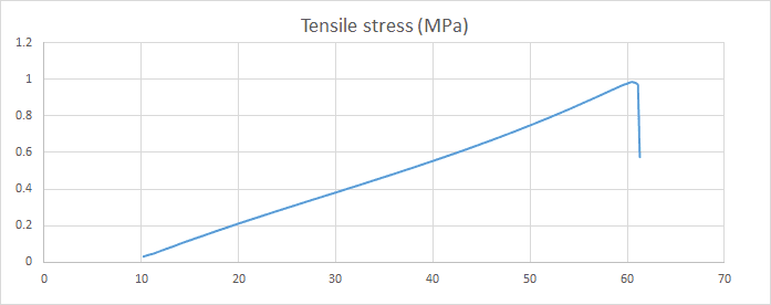
upload_2015-10-31_1-9-14.png


Can someone please help out please?
 

Attachments

  • upload_2015-10-31_1-8-23.png
    upload_2015-10-31_1-8-23.png
    3.1 KB · Views: 702
Physics news on Phys.org
  • #2
Please post the actual wording of the problem that you have been given and the data table .
 

FAQ: Graphing stress-strain plots on excel

How do I create a stress-strain plot on Excel?

To create a stress-strain plot on Excel, you will need to first input your data points for stress and strain into separate columns. Then, select both columns and click on the "Insert" tab. From there, click on "Scatter" and choose the type of scatter plot you want. Your stress-strain plot will then be generated.

What is the purpose of graphing stress-strain plots?

Graphing stress-strain plots allows scientists and engineers to visualize the relationship between stress and strain for a specific material. This can help in understanding the material's mechanical properties and predicting its behavior under different conditions.

How do I add labels and titles to my stress-strain plot?

To add labels and titles to your stress-strain plot, select the plot and click on the "Chart Elements" button. From there, you can choose to add axis titles, a chart title, and a legend. You can also modify the appearance of these elements by clicking on them and using the "Format" tab.

Can I customize the appearance of my stress-strain plot?

Yes, you can customize the appearance of your stress-strain plot by selecting it and using the "Format" tab. You can change the chart type, color, and style of the data points, lines, and axes. You can also add gridlines, error bars, and other elements to enhance your plot.

How can I analyze the data from my stress-strain plot?

To analyze the data from your stress-strain plot, you can use Excel's built-in functions such as SLOPE and INTERCEPT to calculate the slope and intercept of the line. These values can then be used to determine the material's Young's modulus, yield strength, and other mechanical properties. Additionally, you can use trendlines and regression analysis to further analyze the data and make predictions.

Similar threads

Back
Top