Graphing trip efficiency - distance over time

In summary, graphing trip efficiency involves plotting distance traveled against time taken to visualize how effectively a journey is completed. This method allows for easy analysis of speed, identifying patterns in travel behavior, and assessing the impact of various factors on overall trip performance. By examining the resulting graph, one can derive insights into optimizing routes and improving travel efficiency.
  • #1
DaveC426913
Gold Member
23,065
6,747
TL;DR Summary
This is a graph of a typical trip I make. What is the grey curve called?
I make this 60km trip every week or two and I've always been obsessed with tracking distance. time and velocity on trips.

[ digression ]
This is a graph I drew up of a different trip, years ago:
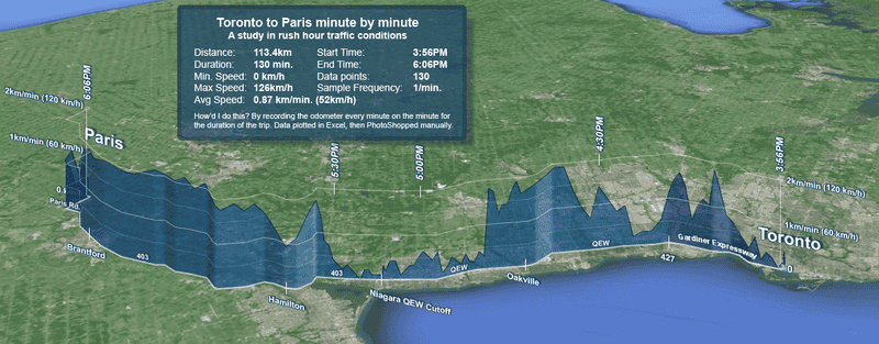
1715651365002.png


This was long before Waze and Google Maps. I had a scrap of paper on my steering wheel and wrote down my odometer reading every minute (and managed to live through the experience).
[ /digression ]

Anyway, now I have Waze, and I watch the distance/time numbers tick down obsessively. It's a 60km trip. The first 5km nd the last 5km are on city street, s the intervening 50km is at highways speed of 100km/h.
On a good day, it takes about 45 minutes. I key my internal progress-o-meter to the one km/minute mark, just to make the mental math easy while I'm driving. I either do better than 1:1 or worse.
A 45 minute trip is 4/3rds of 60/60, so that's an average of 75km/h.
Best speed is 40 minutes, so that's 3/2's, or 90km/h.
If my distance per time stats creeping down toward 1:1, it's gonna be a slow commute.

Anyway, I've bcome hyper-obsessed with how the distance per time changes while I'm driving - as I ramp up from slow streets to the highway and then back down.

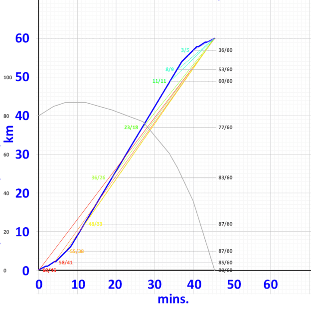
Distance-time graph forms a big S, or integral sign. The blue line:

1715652044675.png


The rainbow-coloured data and lines are slopes - instantaneous rates at various points.

It intrigues me to see that my "best" distance per time is right when I first hit top speed on the highway, and then it gets worse all the way to my destinaton. The grey numbers downt right are simply the same slope data converted to a common denominator of 60, so I can intuit the rate of change. I can see that 87km/hr is my top rate of progress.

I've drawn the (er which is it? Is it the integral or is the derivative?) in grey, which shows how the rate of my progress hits maximum as soon as I hit the highway and then steadily declines.

I'm not sure what that grey curve is called.
 
Mathematics news on Phys.org
  • #2
What data are you measuring to get the grey graph?
 
Last edited:
  • #3
DaveC426913 said:
The rainbow-coloured data and lines are slopes - instantaneous rates at various points.
It's hard for me to make sense of the plot as there are so many curves and sets of numbers on it.
DaveC426913 said:
It intrigues me to see that my "best" distance per time is right when I first hit top speed on the highway, and then it gets worse all the way to my destinaton.
Shouldn't be a surprise. When you hit top speed on the highway, your (instantaneous) velocity is at its maximum. Velocity is the rate of change of distance with respect to time. Your speedometer displays the instantaneous velocity.
DaveC426913 said:
The grey numbers downt right are simply the same slope data converted to a common denominator of 60, so I can intuit the rate of change. I can see that 87km/hr is my top rate of progress.

I've drawn the (er which is it? Is it the integral or is the derivative?) in grey, which shows how the rate of my progress hits maximum as soon as I hit the highway and then steadily declines.

I'm not sure what that grey curve is called.
As best as I can understand what you have plotted, without the details of what you did, it appears to me that the gray graph is the derivative of your velocity graph. This is hard to verify due to the plethora of scale numbers -- two sets on the vertical axis, another on the curves, and another off to the right.
 
Last edited:
  • Like
Likes scottdave
  • #4
scottdave said:
What data are you measuring to get the grey graph?
The grey curve is derived from the grey numbers at the right.
The grey numbers are simply the rainbow coloured-numbers, converted to a common denominator.
The rainbow-coloured numbers are samples of the distance remaining per time remaining.

The rainbow numbers are not instantaneous speed at that point.
 
  • #5
Here it is, simplified and spread over in 2 steps:
1715889126465.png

Blue is the primary data, showing distance over time (speed) at any given time.
Red (AC) is the total average speed (total distance / total time).
Green (BC) is the average speed remaining (remaning distance over remaining time).

The key here, is that at point B, I can see that my average speed for the time remaining has increased. I am making better time now than I was when the journey started. This is reflected by the steeper slope of BC than AC.


So I can compare these values, I convert them to a common demininator, the grey numbers:
1715889414066.png

So the entire journey was going to go at an average speed of 80km/h.
But once I've cleared the back streets in the first few km and made it to the highway my remaining average speed rises to 93km/h.

When I plot that curve of my changing average speed, I get this:

1715889639514.png

My 'average speed for the remainder of the trip' peaks when I first hit the highway, and then it slowly declines all the way to my destination.
 
  • #6
I am trying to think of the usefulness of the information in the gray graph - average speed of remaining trip.

This is not like predicting how much time is remaining. You calculate only after you know the total time, if I understand you correctly.
 
  • Like
Likes DaveC426913
  • #7
DaveC426913 said:
Blue is the primary data, showing distance over time (speed) at any given time.
A graph of cumulative distance versus time is not the same as a graph of speed versus time.
 
  • #8
jbriggs444 said:
A graph of cumulative distance versus time is not the same as a graph of speed versus time.
Exactly
 
  • #9
What you seem to have plotted on the grey line is for any time ## t ## the average speed required to reach the destination in ## t + 60 ## minutes.

Is this something you are interested in?
 
  • #10
pbuk said:
What you seem to have plotted on the grey line is for any time ## t ## the average speed required to reach the destination in ## t + 60 ## minutes.

Is this something you are interested in?
T+60? Or t+45?
It's a 45 minute drive.
 
  • #11
DaveC426913 said:
T+60? Or t+45?
According to you, t + 60:
DaveC426913 said:
The grey numbers downt right are simply the same slope data converted to a common denominator of 60
I haven't checked this.
 
  • #12
pbuk said:
According to you, t + 60:
Where are you drawing this from?

The trip only takes 45 minutes.
I am converting all averge speeds to km/h.
So the 60km trip takes 45 minutes, or 4/3rds of 60 = 80
At the 42 km-to-go mark, it will take 27 mins., which converts to 93.
 
  • #13
Either you are not explaining yourself well or you are making mistakes in your calculations - or, and I believe this is the case, both.

For instance both from your description and from the blue line in #5 it is clear that the last kilometre of the journey takes about 8 minutes, an average speed of 7.5 km/h. However at the start of this interval the grey line is at approximately 45 km/h so this clearly cannot be the average speed for the remaining distance. Also in post #5 you calculate a value of 93 for whatever the grey curve is but in the plot of the curve it is clear that it has a maximum of 87.

I suggest you set out your calculations in a table something like this. Once you understand where the y-values in the plots come from you can begin to think about what the slopes mean.
Time (mins)Distance (km)Average speed (km/h)Remaining distance (km)Remaining time
(mins)
Remaining average speedWhatever you think the grey curve represents
tdv = d / t * 60dr= 60 - dtr = 45 - tvr = dr / trEquation for the grey curve
00
82
 
  • #14
pbuk said:
Either you are not explaining yourself well or you are making mistakes in your calculations - or, and I believe this is the case, both.
I'm terribly sorry for the confusion. I have been indeed been unclear. I pulled a bait & switch and did not inform you adequately.

The graph in post 1 - while not literally based on recorded data - is pretty accurately based on real world experience - including stoplights. A short stint at 30km/h, up to 40 then 60 then 100. Then reversed at the end.

The graph on post 5 is not the same - it is a wildly exaggerated curve, not based on any real data, meant only to highlight what was too subtle in the real graph. Because, for example:
Mark44 said:
It's hard for me to make sense of the plot as there are so many curves and sets of numbers on it.
So that's why I made the second one.

Anyway...
pbuk said:
For instance both from your description and from the blue line in #5 it is clear that the last kilometre of the journey takes about 8 minutes, an average speed of 7.5 km/h.
... maybe we should stick to the real data.


I certainly do appreciate your patience sticking through this confusion.

I could make a table as you illustrate - it might be easier to talk to. It still wouldn't be real data (which I think would actually obfuscate the problem) - it would be idealized (eg. each leg of the journey would be a multiple of a minute/kilometre for simplicity) but it woud be clear enough that there would be no confusion in our dialogue, yes?
 
  • #15
DaveC426913 said:
I could make a table as you illustrate ... it woud be clear enough that there would be no confusion in our dialogue, yes?
No it's OK, I see what you are doing now, and where the error is that was confusing me.

The last point you plotted was 36 km/h at 40 minutes, 57 km and you then drew a straight line to 0 km/h at 45 minutes, implying that the average speed for the remaining trip decreased from 36 km/h to zero linearly over the last 3 km/5 minutes of the trip. This is not correct.

Instead, you should plot a point at 43 minutes, 59 km: 30 km/h. This average speed is in fact the actual speed for the whole of the last kilometre/last 2 minutes of the trip and so the grey curve should be horizontal between (43, 30) and (45, 30), or possibly falling quickly to zero in the last few seconds as you slow to a stop at the end of your journey. I would also plot points at every (major) change of speed which is where the slope of the grey curve changes (significantly).

You then have a useful 'progressometer' - I often use a mental version of this on trips when I am trying to hit an arrival time: I know the last 5 miles of the journey in urban traffic is going to take 15 minutes so with 1h15 to go I check the distance to the destination and deduct 5 miles. If this gives me a speed that is greater than my current speed I speed up.
 
  • Like
Likes scottdave
Back
Top