How Can I Accurately Fit an Airy Distribution Over Noisy Resonance Data?

In summary, the speaker performed a resonance experiment over the past two weeks and collected raw data that should form an Airy-distribution. However, the presence of sub-peaks has made it difficult to fit a function over the data. They are seeking advice on how to best fit an Airy distribution while staying accurate and scientific. Suggestions include manipulating the data by hand or using signal processing techniques. The speaker shares a "dirty trick" they found to filter out the sub-peaks, but acknowledges that it may change the data too much. They ultimately used a Python program to find approximate Airy distributions and adjust them to minimize the difference between the data and the distributions. The end result looks satisfactory.
  • #1
MatthijsRog
14
1
Hi all,

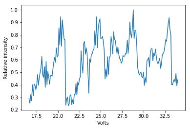
I performed a resonance experiment over the past two weeks, in which I collected the intensity of a Fabry-Perot cavity whilst adjusting the mirror distance with a piezo-element (the specific setup of the experiment is fairly detached from the question I will ask). My raw data is included in the figure:
0jc21p7.png


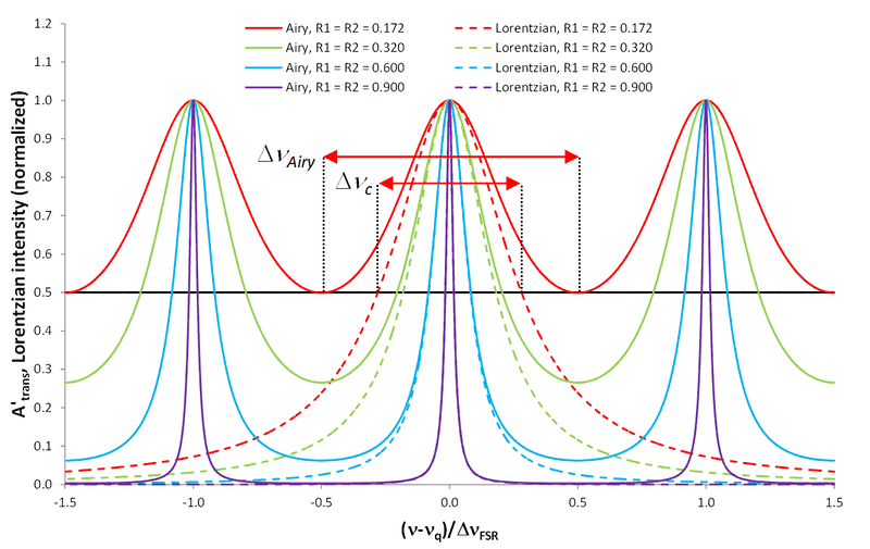
The results should theoretically form an Airy-distribution as shown in the following figure:
Airy_distribution_of_a_Fabry-Perot_interferometer.png

Mind that the dashed lines are NOT Airy-distributions. The Airy distribution is also given by

158ea9f2a040decdd53b339f07ca937309304b0b


In the case of my experiment, R1 and R2 are known while the argument of the sine is a linear function of the x-axis.

While the resonance peaks are clearly visible in my data (they are even more or less at constant separation), I'm having trouble fitting a function over it. Because of the small "sub-peak" coming shortly before each major peak, the Scipy.optimize.curve_fit method keeps putting the Airy-distribution's peaks somewhere between the two.

Mind that I'm trying to perform the fit for specified R1 and R2 while trying out different linear functions (f(x) = ax + b) as the argument for the sine.

My question is this: how could I best go about fitting an Airy distribution over my data, staying as accurate and scientific as possible?

I could obviously make the fit by simply trying out different linear functions. But I could only get accurate on the horizontal positions of the peaks, not on the widths of the peaks.

However, I don't know how to manipulate my data to make it workable for a computer while staying scientific.

What would be the best to do in my case? Simply do it by hand?
 

Attachments

  • 0jc21p7.png
    0jc21p7.png
    6.9 KB · Views: 1,054
  • Airy_distribution_of_a_Fabry-Perot_interferometer.png
    Airy_distribution_of_a_Fabry-Perot_interferometer.png
    44.3 KB · Views: 1,049
Physics news on Phys.org
  • #2
It seems to me that the sub-peaks are a second resonance function. Can you just add two together? Or subtract/filter the second one out so you can focus on the bigger one?
 
  • #3
russ_watters said:
It seems to me that the sub-peaks are a second resonance function. Can you just add two together? Or subtract/filter the second one out so you can focus on the bigger one?
It seemed like that to me as well.

From a qualitative point of view, what you see when you perform this experiment is a ring pattern "collapsing" into its center. The sub-peak is caused by the penultimate ring falling into the CCD-array's field of view.

I have yet to take my signal processing courses however. How would one go about performing such a filtering?

A dirty trick I found to only get the main peaks was to divide the data by its median value and then raise the values to a high power: this really sets apart the main peaks, but makes them much thinner, so performing a function fit on these plots is not useful.
 
  • #4
MatthijsRog said:
A dirty trick I found to only get the main peaks was to divide the data by its median value and then raise the values to a high power: this really sets apart the main peaks, but makes them much thinner, so performing a function fit on these plots is not useful.
It does feel to me like that is a "dirty trick" that changes the data too much. It sounds like you are trying to have the computer do a curve fit for you and do only one curve fit without filtering out the second curve. I suggest you do the curve fit yourself at least for the smaller curve. You can identify the wavelength, amplitude and offset from the graph, build a function for it, and literally subract it from the main raw data. That will leave you with two sets of data instead of one. I don't know what software you are using, but you can easily do this in any spreadsheet program...of course, there is probably also signal processing software designed to find the individual curves automatically.

Here's an example of how to do it: wave 1 should be your raw data, wave 2 is your manually created curve and then just change the addition to subtraction.


Caveat: you may actually have three or more superimposed curves, as the smaller curve seems increase in amplitude for two peaks and then decrease for two peaks.
 
  • Like
Likes MatthijsRog
  • #5
Thanks for the help! I'm using the Python language, by the way

The peaks were much broader than the reflectivity of my mirrors predicted, so instead of subtracting the sub-peaks (I couldn't find a broad enough Airy distribution to do that) I did it with a little detour. I found approximate Airy distributions for both peaks and then used a Python program to wiggle the distributions around until the area of difference between the data and the distributions was minimal.

The assumption I made was that both distributions have the same period.

My result is the following:

0x6fi76.png


Looks okay enough, right?
 

Attachments

  • 0x6fi76.png
    0x6fi76.png
    12 KB · Views: 1,220
  • #6
MatthijsRog said:
My result is the following:

View attachment 225226

Looks okay enough, right?
It looks pretty good, but can you also show what adding them together yields?

[edit] I notice your data never goes below 0.2. Perhaps this is some sort of DC signal or noise floor (like dark noise, since you said this is a CCD). Can you add 0.2 to each of your functions for a better fit? That will make them shorter and broader.
 
  • #7
I'd also be careful calling this "noisy" data, as the signal to noise ratio here is clearly very high and the peaks you observe are not noise, but additional meaningful additional data that your simple theory just doesn't capture.

I agree that the sum of those two Airy distributions would be interesting. This also seems like a case where you might devise an integral transform based on Airy distributions as the kernel (as opposed to a Fourier transform, which uses sine waves as the kernel). In essence that's what you've done by fitting two Airy distributions to your data. You just went about it in a more roundabout way.
 
  • Like
Likes russ_watters
  • #8
Sorry for the late reply!

russ_watters said:
It looks pretty good, but can you also show what adding them together yields?

[edit] I notice your data never goes below 0.2. Perhaps this is some sort of DC signal or noise floor (like dark noise, since you said this is a CCD). Can you add 0.2 to each of your functions for a better fit? That will make them shorter and broader.

The strange thing is that I already calibrated the CCD to at the very least filter out bias and dark noise. The only thing I can come up with is that the high intensity of the laser caused the CCD to warm up even further, which generated more dark noise.

What do you mean with adding 0.2 to the functions? Transposing them along the vertical axis?

Airy distributions are meant to not go to zero, but you are right that 0.2 is a little high.

I'll be going into the lab in a few minutes to take a look at the equipment one last time and try to figure it out.

boneh3ad said:
I'd also be careful calling this "noisy" data, as the signal to noise ratio here is clearly very high and the peaks you observe are not noise, but additional meaningful additional data that your simple theory just doesn't capture.

Not sure if I agree. Note that my graph isn't raw data but the intensity of 175 separate measurements. It could very well be that I didn't integrate over the right domain, for example. I'll try out some different methods and come back.

I'll also add up the Airy distributions this afternoon and post it.
 
  • #9
MatthijsRog said:
Sorry for the late reply!
The strange thing is that I already calibrated the CCD to at the very least filter out bias and dark noise. The only thing I can come up with is that the high intensity of the laser caused the CCD to warm up even further, which generated more dark noise.

What do you mean with adding 0.2 to the functions? Transposing them along the vertical axis?

Airy distributions are meant to not go to zero, but you are right that 0.2 is a little high.

I'll be going into the lab in a few minutes to take a look at the equipment one last time and try to figure it out.

As was suggested to you, you need to ADD those two functions that you came up with. The SUM of those two will be the curve that you need to compare to your data.

Zz.
 
  • #10
Which is why I promise to do that at the bottom of the message? :p
 

FAQ: How Can I Accurately Fit an Airy Distribution Over Noisy Resonance Data?

What is the purpose of fitting a curve over noisy data?

The purpose of fitting a curve over noisy data is to find a mathematical function that best represents the relationship between the data points. This allows for easier interpretation and prediction of the data.

How do you determine the best fit for a curve over noisy data?

The best fit for a curve over noisy data is determined by minimizing the sum of squared errors between the actual data points and the predicted values from the curve. This is typically done using a method called regression analysis.

What are the different types of curves that can be fitted over noisy data?

Some common types of curves that can be fitted over noisy data include linear, polynomial, exponential, and logarithmic curves. The choice of curve depends on the nature of the data and the relationship between the variables.

How can you evaluate the accuracy of the fitted curve over noisy data?

The accuracy of the fitted curve can be evaluated by calculating the coefficient of determination (R-squared value), which measures how well the curve fits the data. A higher R-squared value indicates a better fit.

What are some potential challenges when fitting a curve over noisy data?

Some challenges when fitting a curve over noisy data include overfitting, where the curve fits the noise in the data instead of the underlying trend, and underfitting, where the curve is too simple to accurately represent the data. It is also important to choose the appropriate type of curve and to ensure that the data is properly cleaned and preprocessed.

Back
Top