How can I create a custom histogram with specific bin widths using Wolfram?

  • MHB
  • Thread starter Jameson
  • Start date
In summary, the conversation discusses creating a histogram with custom bin widths and a boxplot using Wolfram Alpha. The user is having trouble customizing the bin width in the histogram and getting the code to work in Wolfram Alpha. Suggestions are made to use Mathematica or Python instead, or to create the graphics in LaTeX using PGFplots.
  • #1
Jameson
Gold Member
MHB
4,541
13
I'm trying to create a simple histogram with custom bin widths. I want the data to be graphed over the ranges:

$[(0,.5],(.5,1],(1,1.5],(1.5,2],(2,2.5],(2.5,3],(3,3.5])$

Here is my data set:

{0.45,0.45,0.473,0.507,0.457,0.452,0.453,1.215,1.256,1.145,1.085,1.066,1.111,1.364,1.254,1.396,1.575,1.617,1.733,2.753,3.186,3.227,3.469,1.911,2.588,2.635,2.725}

If I enter this into Wolfram Alpha:

Code:
Histogram[{0.45,0.45,0.473,0.507,0.457,0.452,0.453,1.215,1.256,1.145,1.085,1.066,1.111,1.364,1.254,1.396,1.575,1.617,1.733,2.753,3.186,3.227,3.469,1.911,2.588,2.635,2.725}]

I get a graph but I can't seem to customize the bin width. Any ideas?
 
Physics news on Phys.org
  • #2
Re: Histogram on Wolfram

Jameson said:
I'm trying to create a simple histogram with custom bin widths. I want the data to be graphed over the ranges:

$[(0,.5],(.5,1],(1,1.5],(1.5,2],(2,2.5],(2.5,3],(3,3.5])$

Here is my data set:

{0.45,0.45,0.473,0.507,0.457,0.452,0.453,1.215,1.256,1.145,1.085,1.066,1.111,1.364,1.254,1.396,1.575,1.617,1.733,2.753,3.186,3.227,3.469,1.911,2.588,2.635,2.725}

If I enter this into Wolfram Alpha:

Code:
Histogram[{0.45,0.45,0.473,0.507,0.457,0.452,0.453,1.215,1.256,1.145,1.085,1.066,1.111,1.364,1.254,1.396,1.575,1.617,1.733,2.753,3.186,3.227,3.469,1.911,2.588,2.635,2.725}]

I get a graph but I can't seem to customize the bin width. Any ideas?
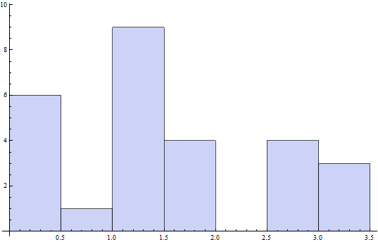
The general syntax for Histogram is Histogram[data,bspec,hspec] (but hspec isn't needed here). So the bspec you want to specify is {.5} (since you seem to be splitting the data into intervals that are .5 units long); thus, the command

Code:
Histogram[{0.45,0.45,0.473,0.507,0.457,0.452,0.453,1.215,1.256,1.145,1.085,1.066,1.111,1.364,1.254,1.396,1.575,1.617,1.733,2.753,3.186,3.227,3.469,1.911,2.588,2.635,2.725},{.5}]

gives me the following graph in Mathematica:


Is this what you're after?
 
  • #3
Re: Histogram on Wolfram

Yep that's it and exactly what I typed into Wolfram Alpha, but apparently it doesn't work on the online version. :(
 
  • #4
Now I'm trying to do a boxplot (this is ridiculously simple I know - it's a class I have to take) and according to the online guide this code should work:

Code:
BoxWhiskerPlot[{0.45,0.45,0.473,0.507,0.457,0.452,0.453,1.215,1.256,1.145,1.085,1.066,1.111,1.364,1.254,1.396,1.575,1.617,1.733,2.753,3.186,3.227,3.469,1.911,2.588,2.635,2.725}]

but alas, nothing. I found another site to make the box plot but I wish this could be done online at W|A.
 
  • #5
Jameson said:
Now I'm trying to do a boxplot (this is ridiculously simple I know - it's a class I have to take) and according to the online guide this code should work:

Code:
BoxWhiskerPlot[{0.45,0.45,0.473,0.507,0.457,0.452,0.453,1.215,1.256,1.145,1.085,1.066,1.111,1.364,1.254,1.396,1.575,1.617,1.733,2.753,3.186,3.227,3.469,1.911,2.588,2.635,2.725}]

but alas, nothing. I found another site to make the box plot but I wish this could be done online at W|A.

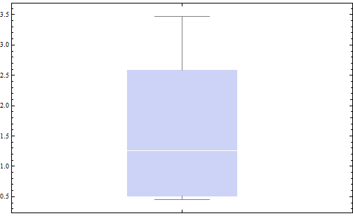
It should be BoxWhiskerChart. Plugging that code (after making that correction) into Mathematica gives me the following:


There was also some additional information you get when you hover over the output in Mathematica:

Max: 3.469
75%: 2.588
Median: 1.256
25%: 0.507
Min: 0.45
 
  • #6
I just need to get a copy of Mathematica on my laptop. Wolfram Alpha doesn't have the full functionality Mathematica does and this code still doesn't work there. Thanks for the help!
 
  • #7
Jameson said:
I just need to get a copy of Mathematica on my laptop. Wolfram Alpha doesn't have the full functionality Mathematica does and this code still doesn't work there. Thanks for the help!

Yea, no problem. Since you're a student, you can get Mathematica for about $140 (if you get the standard edition [which is the one I have]; its cheaper if you want to have it for a year or even a semester [see here for more info]). If you get the standard edition, it's yours to keep even after you're done with school.
 
  • #8
Jameson said:
I just need to get a copy of Mathematica on my laptop. Wolfram Alpha doesn't have the full functionality Mathematica does and this code still doesn't work there. Thanks for the help!

Why pay $140 when Python is FREE. Also, every school I have been to gave me a site license. You should look into that before paying for it to. However, still go with Python.

If you are going to put this graphics in a \(\LaTeX\) document, you could always create it in PGFplots. Here is your code with 7 bins. You would have to look up how to specify bin width but that shouldn't be too hard.

PGFPlots documentation: CTAN: Package pgfplots


Latex Code:

\documentclass[tikz]{standalone}
\
usepackage{pgfplots}
\pgfplotsset{compat = 1.8}
\usepgfplotslibrary{statistics}
\begin{document}
\begin
{tikzpicture}
\begin{axis
}[
ybar interval,
xticklabel =
{$(\pgfmathprintnumber\tick, %
\pgfmathprintnumber\nexttick]$},
font = \scriptsize,
width = 15cm
]

\addplot+[hist = {bins = 7}]
table[row sep = \\, y index = 0]{
data\\
0.45\\ 0.45\\ 0.473\\ 0.507\\ 0.457\\ 0.452\\ 0.453\\ 1.215\\ 1.256\\
1.145\\ 1.085\\ 1.066\\ 1.111\\ 1.364\\ 1.254\\ 1.396\\ 1.575\\ 1.617\\
1.733\\ 2.753\\ 3.186\\ 3.227\\ 3.469\\ 1.911\\ 2.588\\ 2 .635\\ 2.725\\
};
\end
{axis}
\end
{tikzpicture}
\end{document
}
 
Last edited:

FAQ: How can I create a custom histogram with specific bin widths using Wolfram?

What is a Histogram/Boxplot on Wolfram?

A Histogram/Boxplot on Wolfram is a graphical representation of the distribution of numerical data. It displays the frequency or count of data values that fall within certain intervals, or bins, on a bar graph. A boxplot, also known as a box-and-whisker plot, shows the distribution of data by dividing it into quartiles and displaying the median, outliers, and range of the data.

How do I create a Histogram/Boxplot on Wolfram?

To create a Histogram/Boxplot on Wolfram, you can use the built-in functions Histogram and BoxWhiskerChart. These functions take in a list of numerical data as input and automatically generate the graph. You can also customize the appearance of the graph by specifying options such as bin widths or color schemes.

What is the purpose of a Histogram/Boxplot on Wolfram?

A Histogram/Boxplot on Wolfram is used to visualize and analyze the distribution of data. It can help identify patterns, outliers, and trends in the data, as well as provide a summary of the data's central tendency and spread. It is commonly used in statistics, data analysis, and scientific research.

Can I use a Histogram/Boxplot on Wolfram for categorical data?

No, a Histogram/Boxplot on Wolfram is designed for numerical data only. For categorical data, you can use a bar chart or pie chart to display the frequency or proportion of each category.

How can I interpret a Histogram/Boxplot on Wolfram?

To interpret a Histogram/Boxplot on Wolfram, you can look at the shape, center, and spread of the data. A symmetrical histogram or boxplot with a central peak indicates a normal distribution, while a skewed shape may suggest a non-normal distribution. The center of the data can be determined by the median or mean, and the spread can be measured by the range or standard deviation.

Similar threads

Replies
1
Views
13K
Replies
1
Views
5K
Replies
16
Views
3K
Replies
2
Views
3K
Replies
1
Views
2K
Replies
2
Views
1K
Back
Top