- #1
austrosam
- 5
- 0
I am a UK iB student who has just finished year 12 (penultimate year) of secondary education.
As part of the iB I have to do a 4000 word extended essay and I chose to do it on the coefficient of restitution of a metre ruler (I am aware this is slightly bizarre and unusual but I had reasons to pick a metre ruler) along the main axes of a tennis racket. I have collected data for the coefficient of restitution both along the vertical and horizontal axis. I have plotted each set of data individually but I'm now looking to plot both data sets on one set of axes.

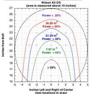
If you look at my attachment, (source: Tennis Warehouse University) you will see how I am planning to plot my data. Ideally I would subsequently introduce a "z" axis to show the coefficient of restitution as rising columns, with the "x" and "y" axes showing the distance along the vertical and horizontal axes of the face of the tennis racket.
My question is, whether you can recommend me any software I could use to carry out such a plot? I am using Graphical Analysis 3.8.4. to plot my conventional x,y plots but I have no previous experience with any other software or types of plot. (I have tried the excel surface plot, it's not what I am looking for).
Else, I could of course use the type of plot as shown in my attachment and plot the coefficient of restitution measured onto its position on the graph as percentages in blobs, but I would prefer a 3d x,y,z plot.
Many thanks everybody!
Sam
As part of the iB I have to do a 4000 word extended essay and I chose to do it on the coefficient of restitution of a metre ruler (I am aware this is slightly bizarre and unusual but I had reasons to pick a metre ruler) along the main axes of a tennis racket. I have collected data for the coefficient of restitution both along the vertical and horizontal axis. I have plotted each set of data individually but I'm now looking to plot both data sets on one set of axes.
If you look at my attachment, (source: Tennis Warehouse University) you will see how I am planning to plot my data. Ideally I would subsequently introduce a "z" axis to show the coefficient of restitution as rising columns, with the "x" and "y" axes showing the distance along the vertical and horizontal axes of the face of the tennis racket.
My question is, whether you can recommend me any software I could use to carry out such a plot? I am using Graphical Analysis 3.8.4. to plot my conventional x,y plots but I have no previous experience with any other software or types of plot. (I have tried the excel surface plot, it's not what I am looking for).
Else, I could of course use the type of plot as shown in my attachment and plot the coefficient of restitution measured onto its position on the graph as percentages in blobs, but I would prefer a 3d x,y,z plot.
Many thanks everybody!
Sam