AlphaCrucis
- 10
- 1
- TL;DR Summary
- I'm to plot the solar spectrum from some data files I'm given and locate and mark on my plot various types of spectral lines
I'm trying to plot the solar spectrum (Wavelength versus Flux) from a table of values I'm given. I'm given 3 columns;
Solar Flux
Arcturus Flux
Wavelength
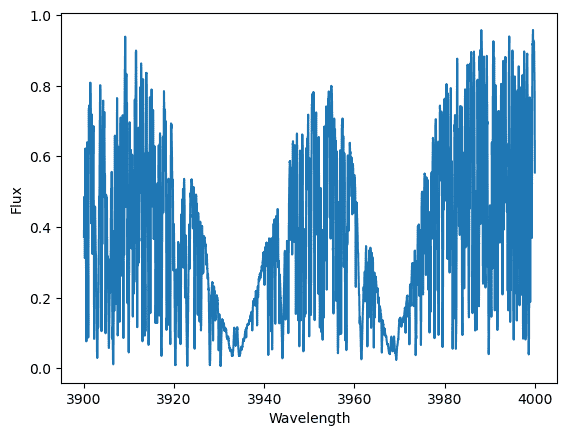
Plotting Solar Flux versus Wavelength gives me a graph (below) that is very difficult to resolve. There are 21,000 data points as well.
If I'm plotting the solar spectrum however; I'm confused what to do with the flux of Arcturus. Is it a calibration standard?
My plot looks like what is shown below; it is difficult to resolve. Perhaps I need to normalize?
 I would like something more like this; (it appears I need to flip my plot as well)

The F/Fc axis for the second image seems like the flux is normalized to a continuum(?).
Solar Flux
Arcturus Flux
Wavelength
Plotting Solar Flux versus Wavelength gives me a graph (below) that is very difficult to resolve. There are 21,000 data points as well.
If I'm plotting the solar spectrum however; I'm confused what to do with the flux of Arcturus. Is it a calibration standard?
My plot looks like what is shown below; it is difficult to resolve. Perhaps I need to normalize?
The F/Fc axis for the second image seems like the flux is normalized to a continuum(?).