Is your website driving away visitors with constant popups and notifications?

  • Thread starter Merlin3189
  • Start date
  • Tags
    Websites
In summary, the cartoon points out how many websites today rely on flashing, intrusive ads and popups that are difficult to close. The joke is that the ads are actually genuine, and the characters in the cartoon are completely unaware of how it would be perceived.
  • #1
Merlin3189
Homework Helper
Gold Member
1,733
824
Hope this (my Q, not the cartoon) is acceptable and of interest to some.

xkcd.jpg

When I saw this, I posted it in the General Chat of my sailing club. I thought it made a point that has been a bee in my bonnet about our (and many other) websites. Not a soul reacted and no one I asked, understood the point.

So I wonder what others - especially any involved in websites - make of it?

At a trivial level, it's not surprising that one particular visitor might miss such a notice, when making a brief visit to find some specific item. A modal window ought to guarantee they react before accessing any other content, so maybe that's the point? I get so fed up with modal dialogues about cookies and privacy, that I may leave a site if I don't really need to stay. But the last frame is irrelevant if they used that.

I assumed that, after the 99,999,999th visitor, there was a popup activated for every visitor until someone responded - which apparently didn't happen and they eventually gave up and kept the car.
For me the point was that this is a very successful site, attracting millions of visitors, with flashing popups and *everything*, which couldn't even give away a car - the ludicrous extreme towards which many websites seem to aspire. The truiumph of what the designers want, over what the users want.
1687960970881.png
 

Attachments

  • 1687960953292.jpeg
    1687960953292.jpeg
    28.8 KB · Views: 77
  • Like
Likes SparkBird and Bystander
Physics news on Phys.org
  • #2
Reminds me of that Mitchell and Webb sketch about a 'massive yacht'.
 
  • Like
Likes DrClaude and Merlin3189
  • #3
Thanks for that. I'd not seen it before. Just as simple as that?
 
  • #4
Yeah, just that.
Remember how the average internet experience used to look like in around the 90s or so? Obnoxious website ads and reappearing, hard to close popup banners all flashing and colourful, telling you you've just won a car or a million dollars because you're the <insert round number> visitor.
All so that you would click on it - which would likely take you to another website with even more such ads, maybe hitchhike a virus or two along the way.
I guess after a while people wised up to these tactics enough that they faded away from most (all?) places.
The joke is not only in that the flashing banner is actually genuine for once, but also the characters seem completely unaware of how it would be perceived.

But yeah, here's me, explaining jokes. You're definitely overthinking it, is the point.
 
  • #5
Bandersnatch said:
Reminds me of that Mitchell and Webb sketch about a 'massive yacht'.
 
  • Like
Likes SparkBird and Bystander
  • #6
laughy scetch J and good cartoon exhibit. @Merlin3189, we’re in the one boat.

Actually, it’s really matter “what the designers want, over what the users want” and I think it worth paying attention to that. It’s not only about web-sites design. If we talk about ads banners, it’s already found that people have “banner’s blindness”. Marketers know about that now and professionals normally investigate the user experience (UX), at time of ads placement or web-site designing.

However, like exactly @Bandersnatch outlined, the main point is the joke is about “how it’s perceived” and I’d add that it’s about the “framed thinking” and about approaches to grabbing attention.
 
Last edited by a moderator:
  • #7
Continuing the subject... It sounds so simple or even funny, but it's actually not a small thing. How often do people care what their words lead to? How much time and resources do we spend looking for the best ways to be perceived and understood by others? Are we paying enough attention to whether we are saying what our listeners really want to hear?

I'm currently working on preparing an eLearning course for a specific software application and I need to ask myself a lot of questions about how to make it catchy, interesting, well-perceived and easy to learn for students. I have to learn also the different methods of presenting materials. I have to think in advance how it is perceived by visuals, auditory, kinesthetic etc., and what tools to use - text, sound, video or cartoons. I need to know, for example, the best saas explainer videos creating practices and approaches in order to apply in my cases.

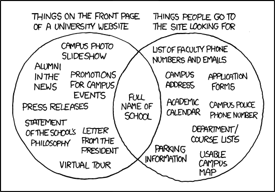
Well, maybe I'm one of those perfectionists or "old school" thinkers, but I think it's really good when people find what they're looking for. It would be really good also in the example shown also if the university website matches what the students want.
 

FAQ: Is your website driving away visitors with constant popups and notifications?

How do constant popups and notifications affect user experience on a website?

Constant popups and notifications can significantly disrupt the user experience by interrupting the flow of information and making it difficult for visitors to focus on the content they came to see. This can lead to frustration and a higher likelihood of visitors leaving the site prematurely.

Do popups and notifications impact website loading speed?

Yes, excessive popups and notifications can negatively impact website loading speed. Each additional script or plugin required to display these elements can slow down the page load time, which can further frustrate users and lead to higher bounce rates.

Can constant popups and notifications affect a website's search engine ranking?

Indirectly, yes. While search engines like Google do not penalize websites specifically for using popups, poor user experience metrics such as high bounce rates and low dwell times can negatively impact a site's search engine ranking. Search engines prioritize user experience, so sites that frustrate visitors are likely to see a drop in their rankings over time.

Are there any benefits to using popups and notifications on a website?

When used sparingly and strategically, popups and notifications can be beneficial. They can capture email sign-ups, promote special offers, or provide important updates. The key is to ensure they are relevant, non-intrusive, and timed appropriately so they do not disrupt the user experience.

What are best practices for using popups and notifications without driving away visitors?

Best practices include limiting the frequency of popups, ensuring they are easy to close, making them relevant to the user, timing them appropriately (e.g., not immediately upon page load), and using them sparingly. Testing different approaches and gathering user feedback can also help in finding the right balance.

Similar threads

  • Sticky
Replies
2
Views
497K
Back
Top