Penrose Diag Black Hole: Riddle Me This

In summary, the conversation discusses the individual's misunderstanding of Penrose diagrams, particularly in relation to black holes. The individual questions why black hole Penrose diagrams have a 45 degree angle for the event horizon and depict the black hole as growing over time. They also present their own personal speculation of what a black hole Penrose diagram should look like. The other person explains that Penrose diagrams are not meant to accurately represent the size of a black hole, but rather its causal structure and representation of infinity. They also caution against making personal speculations without a full understanding of the topic.
  • #1
sbaker8688
29
6
TL;DR Summary
Why doesn't the Penrose diagram of a black hole look like this?
I'm no expert in this stuff, and perhaps I don't understand these diagrams, but having said that, I don't understand why the typical Penrose diagrams I see of black holes look the way that they do. They all have a 45 degree (light speed) angle for the event horizon of the black hole, and they always seem (to my understanding) to depict the black hole as growing over time, and/or taking up huge amounts of space (like, infinite).

Here is my (mis?) conception of what a black hole Penrose diagram should look like. Assume this thing just formed at time and space coordinates 0,0 (the present). The event horizon has a width W. I've colored the black hole red in the diagram. To me, it should basically be a shaded box going straight up to infinity.

Explain why this is wrong. Thanks.
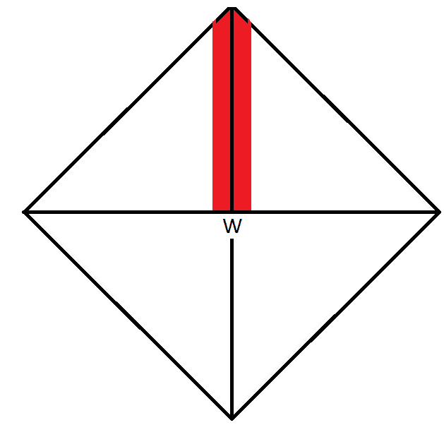
1657162187815.png
 
Physics news on Phys.org
  • #2
sbaker8688 said:
Explain why this is wrong.
That isn't how it works. We don't discuss personal speculations here. You admit you don't understand Penrose diagrams; that means you should not be trying to come up with your own version of a Penrose diagram of anything, black hole or otherwise. You should be trying to learn how Penrose diagrams actually work first, and why the actual Penrose diagrams you see in the literature, including those of black holes, look the way they do.

sbaker8688 said:
They all have a 45 degree (light speed) angle for the event horizon of the black hole
That's because lightlike surfaces always look that way in all Penrose diagrams. The event horizon of a black hole is a lightlike surface.

sbaker8688 said:
they always seem (to my understanding) to depict the black hole as growing over time
You can't judge those things from Penrose diagrams; they are very, very different from an ordinary spacetime diagram, because the scale of the diagram varies from place to place in the diagram. Inside the black hole region, a given apparent "distance" on the diagram represents a much smaller actual distance than outside, and the further away you get from the horizon line into the black hole region, the smaller the actual distance represented by a given apparent distance on the diagram gets. So you cannot infer, from the fact that the black hole region appears to "grow" with "time", that the actual interior of the actual hole is doing that.

Furthermore, the spacetime inside a black hole does not work the same as the ordinary space and time you are used to; in fact, there is no well-defined "size" for the black hole's interior at all. Depending on how you choose to split up spacetime inside the hole into "space" and "time", you can assign any "size" you like to the hole's interior, from vanishingly small (approaching zero) to indefinitely large (approaching infinity).

A Penrose diagram is not meant to accurately represent the "size" of a black hole. The main purpose of a Penrose diagram of any spacetime is to represent its causal structure: what regions can or cannot send light signals to, or receive light signals from, what other regions. Also to represent what "infinity" looks like, since that can be different for different spacetimes (some spacetimes do not even have a well-defined "infinity" at all).
 
  • #4
PeterDonis said:
That isn't how it works. We don't discuss personal speculations here. You admit you don't understand Penrose diagrams; that means you should not be trying to come up with your own version of a Penrose diagram of anything, black hole or otherwise.
Personal speculations? I came here and asked a question.

I admitted I don't understand Penrose diagrams? 1) Humility, unlike what you are giving off, 2) Isn't that why someone would come here and ask a question? Because they don't understand something?

I shouldn't be trying to come up with my own version of a Penrose diagram? So let me get this straight. I have a question about how, or why, something isn't X instead of Y. So I draw X, and ask someone to point out how it's wrong. So... that's a crime?

If this is how you treat people here, I came to the wrong place. I'll find another forum.
 
  • Skeptical
  • Like
Likes Motore, weirdoguy and Delta2
  • #5
sbaker8688 said:
I came here and asked a question.
Only in the sense that you first put forward your personal speculation and then "asked" us to explain why it's wrong. That counts as personal speculation here.

sbaker8688 said:
I admitted I don't understand Penrose diagrams?
You qualified it with "perhaps", but you admitted you are "no expert", which amounts to the same thing. Quibbling over words is not likely to lead to a useful discussion.

sbaker8688 said:
I shouldn't be trying to come up with my own version of a Penrose diagram?
If you don't understand how they work, no. We have found from long experience that making up your own model of something you don't understand and then asking others to explain why it's wrong is not a good way to understand something in science.

sbaker8688 said:
I have a question about how, or why, something isn't X instead of Y.
I understand that that's how you asked the question in your OP. What I am explaining to you is that that's the wrong question to ask. As you ask it, the question is unanswerable, because there are so many wrong assumptions built into it that it would take more time to try to disentangle them than to just discard the question and switch to a different way of trying to learn about this topic. Such as, looking at a correct Penrose diagram of a black hole and asking why it is the way it is.

By the way, if you are under the impression that you are being singled out in some way, you're not. Everyone that learns anything about any area of science deeper than just a quick sound bite has to go through the same experience, of finding out that it's not just that you don't have answers to the questions you want to ask, but that the questions you want to ask are themselves not the right questions. I went through the same thing when I first started learning about Penrose diagrams--not to mention all the other areas of science I've learned about. Your experience is not unique.

sbaker8688 said:
So... that's a crime?
Nobody accused you of a "crime". Further, I did a lot more in post #2 than just point out that your proposed diagram was personal speculation. I gave you good information about why the correct Penrose diagram of a black hole looks the way it does. If you want to understand this topic, reading what I wrote, as well as the references @robphy gave you in post #3, thinking about what you've read, and asking further questions based on your reading, would be a much better way to proceed than complaining.

sbaker8688 said:
If this is how you treat people here, I came to the wrong place. I'll find another forum.
It is, of course, your choice whether or not to post here. We assume that people come here wanting to understand. Based on our experience and knowledge of the topic you are asking about, we think the best way to help you understand is to first "unask" the question you asked, and try to lead you to a better framing of the topic. If you don't want to learn that way, you are of course free to go seek help somewhere else.

But to view our responses as treating you badly in some way is simply not correct. We can't help it if we judge, based on a knowledge of the topic that you have admitted you don't have, that the way you have asked your question is not going to lead anywhere useful. And having made that judgment, we are going to tell you that. That's how we work here.
 
  • Like
Likes Motore
  • #6
Post edited by Mentor berkeman to remove insults
As for others, I reposted this question on another forum since it isn't going so well here, but just in case someone else wants to help answer this (as long as you are actually trying to be helpful, constructive, and friendly, otherwise please don't), I came up with more diagrams and questions, to hopefully communicate my questions better.

Here's a typical diagram I see:

1657227749067.png

One issue I have here is that, if I'm understanding the diagram above correctly, the black hole is growing. Now, nothing wrong with depicting a growing black hole, but that's the ONLY depiction I ever see. It makes me think something is wrong, either in my understanding of these drawings, or something else.

We only have 1 dimension of space here, and then time. So I will superimpose the 1-dimensional black hole on top of the drawing above, at different times, so as to present this as how I'm understanding it, or misunderstanding it.

1657227929580.png

The horizontal lines at t0, t1, t2, t3, t4, and t5 are what I would assume to be the 1 dimensional black hole growing horizontally over time t0, t1, t2, etc. Is this correct, or not? If not, why not? If correct, why present this thing as growing (I'd understand if I see drawings of non-growing black holes, growing black holes, these black holes, those black holes, etc. but I only see growing ones)?

Thanks for any considerate, constructive help.
 
Last edited by a moderator:
  • Skeptical
Likes weirdoguy
  • #7
Peter can be less tactful than I would be, but he is very rarely unhelpful. In fact, he answered all your questions in #2.

The short form is that the horizontal lines you are drawing have little to do with anything you might loosely call "space" inside the black hole. This is because the Penrose diagram is a very abstract representation of a black hole, flattening out the extreme curvature. You don't look at these diagrams to understand what is space, you look at them to understand causal connections between patches of spacetime.

You certainly can define spacelike planes from those horizontal lines. But there isn't a unique notion of space inside the black hole to start with, and any choice reflecting the symmetry of the situation is probably going to be infinite, won't cross the event horizon, and wouldn't be interpreted as a cross section of the black hole by an exterior observer anyway.
 
  • #8
Ibix said:
The short form is that the horizontal lines you are drawing have little to do with anything you might loosely call "space" inside the black hole. This is because the Penrose diagram is a very abstract representation of a black hole, flattening out the extreme curvature. You don't look at these diagrams to understand what is space, you look at them to understand causal connections between patches of spacetime.

You certainly can define spacelike planes from those horizontal lines. But there isn't a unique notion of space inside the black hole to start with, and any choice reflecting the symmetry of the situation is probably going to be infinite, won't cross the event horizon, and wouldn't be interpreted as a cross section of the black hole by an exterior observer anyway.
Thank you for your response.

Perhaps this will help. Let me drill down to extreme basics.

QUESTION1: On a penrose diagram, we are representing 1D space (x-axis) across time (y-axis) (I get that there is 'warpage' or 'compactification' going on - forget that for the moment). True, or False? If you say true, I will continue. If you say false, I will say "thanks - then I don't understand this" and I will bid you good day.

QUESTION2: Assuming we got past question 1 above, you say the horizontal lines have little to do with space inside the black hole, yadda yadda. Fine. Would it help, then, or be any different, if we only concentrated on what's going on ONLY on the event horizon? In other words, if I redrew the diagram, but depicted the event horizon only, and our view or perception of this from the outside, would that be a constructive enterprise?

Thanks again.
 
  • #9
In addition to the links I posted earlier, here's a video from PBS Space Time
(the Penrose diagram starts at t=3m45s)
 
  • #10
robphy said:
In addition to the links I posted earlier, here's a video from PBS Space Time
(the Penrose diagram starts at t=3m45s)

Yup, I saw all of those - thanks. They don't answer my questions, but they are nice to see.
 
  • Like
Likes Delta2
  • #11
I believe I have figured out the problem. You can't just drop a black hole in the middle of a penrose diagram, because the space time is too flat there. The diagram won't automatically warp spacetime around a black hole that you just drop into the center.

This seems to prove it. I drew a light cone next to the event horizon, depicting someone falling in. There should be no way out, but the light cone depicts that you could escape.

1657233758753.png

This is why these drawings often depict black holes way out at infinity, on the edge of the diagram. That's misleading, because all black holes aren't off at infinite distance. But if you drop one off there, at least light cones make sense.

The real misleading drawing is the one depicting a growing black hole.

Anyway, bottom lines: 1) you can't just drop off a black hole in the middle of one of these drawings, 2) In the one where they do that, they depict it as growing so that at least the light cones make sense. But it does much more harm than good, because you question why the thing is growing (in fact, the event horizon is expanding at the speed of light in these drawings).
 
  • #12
sbaker8688 said:
I don't understand why the typical Penrose diagrams I see of black holes look the way that they do.
They are, as @Ibix pointed says above, very abstract depictions of a fairly counter-intuitive geometry; the distance between points on in a Penrose diagram does not correspond to spatial distance in any way that we usually understand distance.

For me, I didn't understand the spacetime geometry of a black hole until after I had figured out Kruskal diagrams (specifically regions 1 and 2). Although no less abstract than the Penrose diagram, a Kruskal diagram shows how our intuitive notions of time and space map onto the spacetime of a black hole (formally, they show curves of constant Schwarzschild ##r## and ##t##, and the lightlike geodesics that represent the paths of light signals are drawn at 45 degree angles).

So my advice is to start with the Kruskal diagram - once you're comfortable with it you will be much more able to understand Penrose diagrams and what they're telling you.
 
  • Like
Likes Ibix
  • #13
sbaker8688 said:
QUESTION1: On a penrose diagram, we are representing 1D space (x-axis) across time (y-axis) (I get that there is 'warpage' or 'compactification' going on - forget that for the moment). True, or False?
The diagram represents a 2d slice through spacetime, yes. But you are wrong to identify the vertical direction as time and the horizontal one as space - in fact, every direction below the 45° line at every point will be identified as "space" by someone, and every direction above 45° is "time" for someone. And the map shows an infinite spacetime on a finite region, so has extremely peculiar scaling.
sbaker8688 said:
Would it help, then, or be any different, if we only concentrated on what's going on ONLY on the event horizon?
The event horizon isn't a place, it's a null surface, so 'on' the event horizon is a tricky concept.

The problem is that the sensible way to draw spacelike planes in the exterior region ends up connecting the right hand corner to the lower left vertical line - the planes do not cross the event horizon. Similarly a sensible way to draw planes inside the horizon has them run from the corner where the event horizon (red line) meets the singularity line to the upper left vertical, and never cross the horizon.

You could draw arbitrary lines and define them to be space, as you have done (although you'd have to make them go through the right hand corner). I think you'd find that the properties of such a definition are rather peculiar - I suspect you'd need a computer, clock, ruler and inertial navigation system to measure your shoe size in such a scheme.
sbaker8688 said:
I believe I have figured out the problem. You can't just drop a black hole in the middle of a penrose diagram, because the space time is too flat there. The diagram won't automatically warp spacetime around a black hole that you just drop into the center.
No, this is not a sensible way to think about this.

The spacelike direction shown on the actual Penrose diagrams you've shown is the radial distance from the center of the collapsing star - this can only be positive, hence why the diagrams are bounded at the left. The black hole is the entire triangle at the upper left and extends to infinity in time - it does not depict a black hole expanding to engulf the whole universe. Spatial infinity is the right hand corner.
 
  • Like
Likes Orodruin
  • #14
Nugatory said:
So my advice is to start with the Kruskal diagram - once you're comfortable with it you will be much more able to understand Penrose diagrams and what they're telling you.
Second this notion. However, note that the Kruskal diagram shows an eternal black hole, not one forming by stellar collapse. Unless there's a variation I haven't seen...
 
  • #15
sbaker8688 said:
On a penrose diagram, we are representing 1D space (x-axis) across time (y-axis) (I get that there is 'warpage' or 'compactification' going on - forget that for the moment). True, or False?
Mu. "1D space" and "time" do not have invariant meanings. A Penrose diagram is drawn in a particular set of coordinates; and you are correct that to the extent that the diagram does represent "1D space (x-axis) across time (y-axis)" in those coordinates. But those coordinates do not have any straightforward physical meaning. The only straightforward physical meaning that can be read off a Penrose diagram is, as I said in post #2, that lightlike curves are always 45 degree curves, so causal boundaries--boundaries of what regions of spacetime can or cannot send or receive light signals to or from what other regions of spacetime--are easily seen. But nothing else about the "space" or "time" of the diagram corresponds to anything you are used to.

sbaker8688 said:
if I'm understanding the diagram above correctly, the black hole is growing.
You're not understanding the diagram correctly. I already explained why in post #2. The "event horizon" line marks a line at which every point represents a 2-sphere with the same surface area (##4 \pi r_s^2##, where ##r_s## is the Schwarzschild radius of the black hole). So every point on that line represents a 2-sphere of the same "size". (Actually, that's only true for the portion of the horizon outside the collapsing matter that formed the hole. More on that below.)

sbaker8688 said:
You can't just drop a black hole in the middle of a penrose diagram
Yes, you can. Your proposed "solution" is not correct. The diagrams you showed in post #6 are correct Penrose diagrams of a black hole, as far as they go. One thing they do leave out is the collapsing matter that formed the hole in the first place. For a diagram that shows that, see the OP of this thread:

https://www.physicsforums.com/threa...ck-hole-with-a-changing-event-horizon.968233/

The area shaded in blue represents the region of spacetime occupied by the collapsing matter. Note that the diagram is not strictly correct: the blue shaded area should narrow down to the top left corner, right where the vertical r = 0 line at the left edge meets the wiggly r = 0 singularity line at the top. That top left corner point represents the event at which the collapsing matter reaches zero size and vanishes, forming the singularity.

Note also that the event horizon line is still a 45 degree line going up and to the right; but it starts at the r = 0 line on the left inside the collapsing matter. In fact, that event, where the event horizon starts at the r = 0 line, is the specific event where the event horizon forms, at the center of the collapsing matter; the horizon then expands outward until it reaches the surface of the collapsing matter (the point where it crosses the outer right edge of the blue shaded area). Once the horizon exits the surface of the collapsing matter, it remains the same size afterwards (the size--surface area--that I gave above). At least, it does provided no other matter falls in; the thread linked to above discusses what happens in the case that more matter does fall in.

Another prior thread on Penrose diagrams is here:

https://www.physicsforums.com/threads/penrose-diagrams-introduction.699126/

sbaker8688 said:
these drawings often depict black holes way out at infinity, on the edge of the diagram.
No, they don't, although Penrose diagrams can be confusing in this respect. The point marked ##i^+## on the diagram, which is future timelike infinity, does not connect with either the event horizon or the singularity. If you zeroed in on that area of the diagram, you would see the singularity ending in a point, the event horizon ending in a separate, disconnected point just to the right of it, and the ##i^+## point as another separate, disconnected point to the right of that.

sbaker8688 said:
the event horizon is expanding at the speed of light in these drawings
No, it's not. The event horizon is an outgoing null surface, i.e., it is made of radially outgoing light rays, but it is not expanding; its surface area stays constant (once it is outside the collapsing matter that formed the hole). The reason a surface made of radially outgoing light rays can be not expanding and maintain a constant surface area is the spacetime curvature of the hole.
 
  • #17
PeterDonis said:
the diagram does represent "1D space (x-axis) across time (y-axis)" in those coordinates.
Btw, there are other coordinates in which the hole's horizon does look more like what you were probably expecting, like a vertical "cylinder". For example, that's how it looks in ingoing Eddington-Finkelstein coordinates. But in those coordinates, inside the "cylinder", the "vertical" direction is no longer "time"--it's "space". So you are trading one confusing thing for another. It's simply not possible to draw a spacetime diagram of a black hole that works like the ordinary spacetime diagrams from special relativity. That's unavoidable, because a black hole spacetime is simply different from the flat spacetime of special relativity.
 
  • #18
Nugatory said:
So my advice is to start with the Kruskal diagram - once you're comfortable with it you will be much more able to understand Penrose diagrams and what they're telling you.
Will do!
 
  • #19
Ibix said:
The diagram represents a 2d slice through spacetime, yes. But you are wrong to identify the vertical direction as time and the horizontal one as space - in fact, every direction below the 45° line at every point will be identified as "space"...
<snip>
The spacelike direction shown on the actual Penrose diagrams you've shown is the radial distance from the center of the collapsing star - this can only be positive, hence why the diagrams are bounded at the left. The black hole is the entire triangle at the upper left and extends to infinity in time - it does not depict a black hole expanding to engulf the whole universe. Spatial infinity is the right hand corner.
Based on this, and other things I've read here, I think I was misled (either because I misinterpreted it, or because it is wrong) by this diagram:

1657255098977.png


This is the thing I've interpreted as a black hole at the "center" of a Penrose diag. This is what I've been referring to when I say the black hole seems to grow, and that the event horizon seems to grow at the speed of light.

Three possibilities:

1) This is a black hole at the center of a Penrose diagram (i.e. not off at the northwest triangle), and it is wrong. This is what I want to hear.

2) This is a black hole at the center of a Penrose diagram (not off at the northwest triangle), and it is correct. If so, this is what has confused me (or, at least one thing). I don't want to hear this.

3) This is actually a northwest triangle thing, and I've misinterpreted it as the center of a Penrose diagram. I don't mind hearing this.

Now, I've always understood the diagram below - the typical northwest triangle thingie. I just always wondered why it always had to be in the northwest quadrant like that (or... I thought it didn't have to be in the northwest quadrant like that). Based on what you've said, I now know that this is where it must be. At any rate, this never looked like an expanding black hole to me, nor an event horizon that grows at the speed of light (the ABOVE diagram does, because I always took it to be the area labeled "Universe" below).

1657255643705.png


One of the main mistakes I made was thinking you could drop a black hole in the center of what is labeled "Universe" above. My attempt at doing that was the diagram with the red box going straight up from the center.
 

Attachments

  • 1657256135170.png
    1657256135170.png
    4.1 KB · Views: 111
  • #20
Note that whenever I have said "drop a black hole at the center" or "this diagram represents a black hole at the center" etc, I always meant at this center of THIS (below), which is the same thing labeled "universe" above:

1657256581254.png
 
  • #21
sbaker8688 said:
I think I was misled (either because I misinterpreted it, or because it is wrong) by this diagram
Where have you seen this diagram? (Note that a complete Kruskal diagram, such as you will see in one of the series of Insights articles I linked to, looks something like it, but a diagram of a realistic black hole that forms by collapse of a massive object does not--it is only "one sided", not "two-sided".)

sbaker8688 said:
This is a black hole at the center of a Penrose diagram (i.e. not off at the northwest triangle), and it is wrong.
It is wrong in the sense that, as above, the Penrose diagram of a realistic black hole--one that forms by gravitational collapse of a massive object--will not look like it. It will look like the "one-sided" diagram with the hole in the "northwest corner", and with a region on the left, partly outside the hole and partly inside, occupied by the collapsing matter (as in the thread I linked to in an earlier post).

sbaker8688 said:
This is a black hole at the center of a Penrose diagram (not off at the northwest triangle), and it is correct.
It is correct in the sense that it describes a valid mathematical solution of the Einstein Field Equation (or at least a portion of such a solution). But that solution is not physically realistic because there is no way physically for it to form; there is no matter or energy anywhere in this solution, yet it somehow has a black hole in it (and in the region not shown in the diagram you gave, but "below" it, there is also a "white hole").

sbaker8688 said:
This is actually a northwest triangle thing
Yes, there is. See above.

sbaker8688 said:
whenever I have said "drop a black hole at the center" or "this diagram represents a black hole at the center" etc, I always meant at this center of THIS (below), which is the same thing labeled "universe" above
Ah, I see. Yes, you can't just "drop" a black hole into the center of the "Universe" in that sense, because you can't just "change" a spacetime geometry. The "universe" geometry is what it is; and in the case of the "universe" that has a black hole off to the "northwest" of it, the "universe" geometry is the geometry of the region outside the hole, which has "distant spacetime" and "infinity" and so on in it. You can't just declare by fiat that there is suddenly a black hole in the middle of it; you have to actually solve the Einstein Field Equation and see where the solution puts the "black hole" region and where it puts the "universe" region and what the geometry of each region is.

Note, btw, that the two "diamond" shaped "Universe" regions you showed (the first in post #19 and the second in post #20) are actually not quite the same. The post #20 "Universe" has "distant spacetime" off to the left and to the right. That's actually not correct if it is supposed to be a valid Penrose diagram, because each "point" in a Penrose diagram represents a 2-sphere. A Penrose diagram of plain old flat Minkowski spacetime looks like the right half of a "diamond" only--it has a vertical line representing ##r = 0##, the "center" of the "Universe", on the left, and the half "diamond" on the right extending out to "distant spacetime". Extending it to a full diamond would be claiming that there are two ways to go "radially outward" from ##r = 0##--not just two (or more) different angular directions (like "towards London, England" and "towards Auckland, New Zealand" from the center of the Earth), but two ways each containing a full 2-sphere's worth of angular directions, instead of the one 2-sphere's worth of angular directions that we're used to. That does not describe any spacetime geometry that I am aware of.

The "diamond" shaped "Universe" region in the post #20 diagram is correctly shaped as a diamond, but notice that its left side is not "distant spacetime". It is bounded by the horizon on the upper left and an "antihorizon" on the lower left (and the "antihorizon" extends further up and to the left as another boundary of the black hole region). This diagram is actually a portion of the complete Penrose diagram of the idealized spacetime I described above as being a valid mathematical solution but not physically realistic. In a physically realistic spacetime describing a black hole that forms from the collapse of a massive object, the "antihorizon" would not be there and the left side of the diagram would be occupied by the region of spacetime containing the collapsing matter.
 
  • #22
Btw, a good page on Penrose diagrams, which @sbaker8688 may already be aware of since its first diagram looks like the one in post #20 is here:

https://jila.colorado.edu/~ajsh/insidebh/penrose.html

The second diagram on that page is the one I have been referring to as a valid mathematical solution that is not physically realistic. Note that the top portion of it looks something like the post #19 diagram.
 
  • #23
PeterDonis said:
There is one in the fourth of our series of Insights articles on the Schwarzschild geometry:
I'd completely forgotten that - thanks.
 
  • #24
@sbaker8688: The first diagram in #19 is wrong. Either half of it is correct, but bolting two halves together like that is wrong for more or less the same reason that bolting a second Mercator projection of the world to the top of a standard atlas is wrong. Each point in the diagram already represents a spherical slice of spacetime and adding the second half duplicates that. And it probably messes up the topology.

The second diagram is correct but is not of the same thing. It's a Penrose diagram of an eternal black hole, an empty spacetime with a black hole that exists forever, not a black hole forming by gravitational collapse. Interestingly, in this case you can glue a flipped copy of it to the left hand diagonal (see the colorado.edu site Peter linked) to get a Penrose diagram of the maximally extended Schwarzschild spacetime.

Finally, the pretty diagram in #20 is wrong for the same reason as the first one in #19. It's supposed to be only the right hand (or left hand) half. Bolting another half on double-counts spacetime and definitely messes up the topology.
 
  • #25
PeterDonis said:
Ah, I see. Yes, you can't just "drop" a black hole into the center of the "Universe" in that sense, because you can't just "change" a spacetime geometry.
This is what I meant when I said
sbaker8688 said:
I believe I have figured out the problem. You can't just drop a black hole in the middle of a penrose diagram, because the space time is too flat there. The diagram won't automatically warp spacetime around a black hole that you just drop into the center.
At any rate, this eventually became quite helpful, and I appreciate all who helped me figure out the issues in my understanding.

Thanks.
 
  • Like
Likes berkeman

FAQ: Penrose Diag Black Hole: Riddle Me This

What is a Penrose Diag Black Hole?

A Penrose Diag Black Hole is a theoretical type of black hole proposed by physicist Roger Penrose. It is characterized by a spinning ring singularity instead of a point-like singularity at the center.

How is a Penrose Diag Black Hole different from a traditional black hole?

A traditional black hole is described by the Schwarzschild metric, which has a point-like singularity at the center. The Penrose Diag Black Hole, on the other hand, is described by the Kerr metric, which has a spinning ring singularity.

What is the significance of the spinning ring singularity in a Penrose Diag Black Hole?

The spinning ring singularity in a Penrose Diag Black Hole is significant because it allows for the existence of closed timelike curves (CTCs). These are paths that loop back in time, which could potentially violate the laws of causality.

Can a Penrose Diag Black Hole actually exist?

Currently, there is no evidence to suggest that Penrose Diag Black Holes exist in our universe. They are purely theoretical objects that have not been observed or detected.

What is the "riddle" associated with the Penrose Diag Black Hole?

The "riddle" of the Penrose Diag Black Hole refers to the paradox of CTCs and the potential violation of causality. It poses a challenge to our understanding of the laws of physics and the nature of time in the presence of a spinning ring singularity.

Similar threads

Replies
46
Views
4K
Replies
7
Views
2K
Replies
22
Views
2K
Replies
37
Views
4K
2
Replies
43
Views
2K
Replies
6
Views
2K
Back
Top