Periodic spiral graph interpretation

In summary, the conversation discusses the geometry of a spiral graph and why it is designed in a specific way. The graph is used to convey information in a more condensed way compared to a linear graph. The conversation also touches upon the asymmetry of the graph and the possibility of it being an optical illusion. The conversation ends with the discovery of a missing quadrant and the varying slope along the graph.
  • #1
DaveC426913
Gold Member
23,070
6,747
TL;DR Summary
Is this graph spiral or merely polar?
Could someone explain the geometry of this graph?
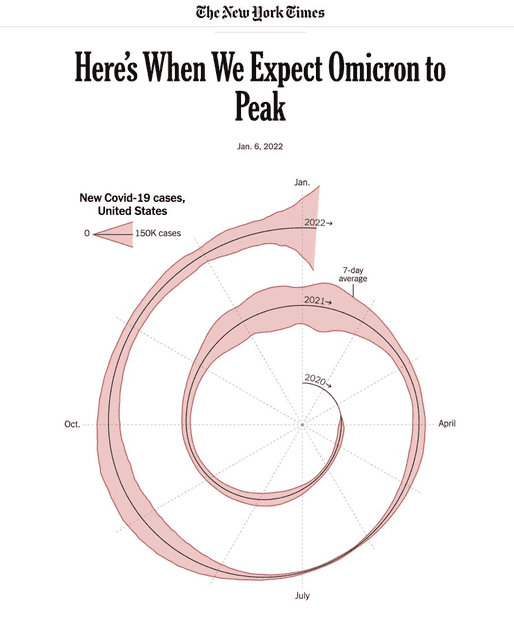
  • Why does the radial distance vary non-uniformly? To-wit: Distance from origin to Nov 2020 is much larger than Nov 2020 to Nov 2021
  • Why are there two areas - one above and one below - the centre line?
https://www.nytimes.com/2022/01/06/opinion/omicron-covid-us.html

1641581353167.png
 
Mathematics news on Phys.org
  • #2
DaveC426913 said:
Summary:: Is this graph spiral or merely polar?

Could someone explain the geometry of this graph?
  • Why does the radial distance vary non-uniformly? To-wit: Distance from origin to Nov 2020 is much larger than Nov 2020 to Nov 2021
It's spiral, and the only reason for doing it this way is to convey the information in less space than a linear graph would take. The radial distance varies, I believe, to leave room for the bulging sections.
DaveC426913 said:
Why are there two areas - one above and one below - the centre line?
To display the data for 1) Apr to Oct of 2020, and 2) for Apr to Oct of 2021.

Don't overthink this...
 
  • Like
Likes DaveE
  • #3
Mark44 said:
To display the data for 1) Apr to Oct of 2020, and 2) for Apr to Oct of 2021.

Don't overthink this...
No, I mean why is it symmetrical about the centerline? This is common in graphs that differentiate gender - having male on one side and female on the other, but I doubt that the case here.
 
  • #4
Mark44 said:
The radial distance varies, I believe, to leave room for the bulging sections.
Except it doesn't do that. :))
 
  • #5
DaveC426913 said:
No, I mean why is it symmetrical about the centerline?
I think that is just a decision that the graph-maker made. It may have no significance at all, except that someone thought the graph looked better that way (and I tend to agree).
 
  • #6
DaveC426913 said:
No, I mean why is it symmetrical about the centerline?
Because that's how the person who made the graph wanted it.
DaveC426913 said:
Except it doesn't do that. :))
Sure it does -- look how fat the sections for January are.

Again, don't overthink this.
 
  • #7
Mark44 said:
Sure it does -- look how fat the sections for January are.
Yet the biggest gap between 2020 and 2021 is in October.Anyway, I grant your point. So much visualization opportunity lost. I will just have to out this rendering down as an affront to the god of graphs.
 
  • #8
It's weird. The width of the path is the daily cases, the angle is the time in the year, the distance to the origin seems to have no significance.
 
  • #9
IMO, it looks like some intern at the NYT had way too much time on their hands, and basically hand-drew a graph to try to visualize the data. There are clear non-symmetries that suggest the hand-drawn aspect. Whatever.

1641606904646.png
 
  • #10
berkeman said:
There are clear non-symmetries that suggest the hand-drawn aspect.
Are you sure that's an asymmetry? The curve on the bottom will have will appear to have an amplified amplitude, because its ... er ... x-axis is compressed.

1641607605118.png
 
Last edited:
  • Like
Likes mfb and berkeman
  • #11
DaveC426913 said:
Are you sure that's an asymmetry? The curve on the bottom will have will appear to have an amplified amplitude, because its ... er ... x-axis is compressed.
Whelp, if I were an intern trying out different graphing schemes and saw that apparent misinformation in my graph, I'd change to a single-sided representation... Interns, kids, what'cha going to do...
 
  • #12
I added an analysis, above.
 
  • #13
Wait, so YOU are the intern?
 
  • Haha
Likes mfb
  • #14
berkeman said:
Wait, so YOU are the intern?
What? No.
I just Photoshopped the diagram.

When you see the lines that are perpendicular to the curve, the asymmetry disappears.

These circles are centred on the central black line. Their radii touch both red curves. So upper and lower red curves are symmetrical about the black central line.

1641609973692.png
 
Last edited:
  • Informative
Likes berkeman
  • #15
mfb said:
It's weird. The width of the path is the daily cases, the angle is the time in the year, the distance to the origin seems to have no significance.
Comparing their graph to an Archimedean spiral(r = aθ + b), I found that if I shift their graph to the right by ≈58 pixels, it comes out pretty close.

NYT x shifted 58 pixels 2022-01-07 at 9.34.45 PM.png
 
  • Informative
  • Like
Likes Tom.G and DaveC426913
  • #16
OmCheeto said:
Comparing their graph to an Archimedean spiral(r = aθ + b), I found that if I shift their graph to the right by ≈58 pixels, it comes out pretty close.
Huh. I guess the asymmetry of the spiral is also an optical delusion.
 
  • #17
DaveC426913 said:
Huh. I guess the asymmetry of the spiral is also an optical delusion.
Possibly. I notice that if I fiddle with the constants for the Archimedean spiral, I get an even closer fit, and an apparent stretching in the quadrant 1 and 3 directions displays itself.

NYT covid spiral 2022-01-08 at 1.05.25 PM.png

I'm not sure I've ever smooshed something diagonally, mathematically.
I might be able to get a perfect fit, if I can figure that out.
Off the top of my head, it looks like a pain in the butt.
I could rotate everything 45° counter clockwise and then smoosh it in the y direction.
Perhaps I'll try googling this for a better method. My brain is just too old.
 
  • Like
Likes Tom.G
  • #18
Sunuvagun. I would not have believed it if I hadn't seen it.
1641685310686.png


I think two things threw me.
1. There's a missing quadrant:
1641685458406.png

2.
The slope varies wildly along the slope.
1641685984655.png
 
  • Like
Likes docnet

FAQ: Periodic spiral graph interpretation

What is a periodic spiral graph?

A periodic spiral graph is a visual representation of periodic behavior in a system. It is a graph that shows how a variable changes over time in a cyclical pattern.

How is a periodic spiral graph interpreted?

The interpretation of a periodic spiral graph involves identifying the period, amplitude, and phase of the periodic behavior. The period is the length of one complete cycle, the amplitude is the height of the peaks and valleys, and the phase is the starting point of the cycle.

What types of systems can be represented by a periodic spiral graph?

Periodic spiral graphs can be used to represent a wide range of systems, including physical, biological, and chemical systems. Examples include the motion of a pendulum, the growth of a population, and the oscillation of a chemical reaction.

How is a periodic spiral graph different from a regular line graph?

A periodic spiral graph differs from a regular line graph in that it shows cyclical behavior instead of continuous change. This means that the x-axis of a periodic spiral graph does not represent time or another continuous variable, but rather the number of cycles.

What are some practical applications of periodic spiral graph interpretation?

Periodic spiral graph interpretation is useful in many fields, including physics, biology, economics, and engineering. It can help predict future behavior of systems, identify patterns and trends, and provide insight into the underlying mechanisms of complex systems.

Similar threads

Replies
54
Views
9K
Replies
9
Views
7K
Back
Top