- #1
a723w6
- 9
- 0
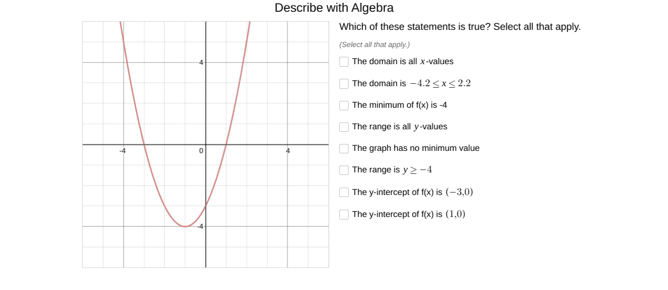
Can someone help me figure out what to mark off on this graph? I am a beginner in Algebra 2 domain and range functions.
a723w6 said:
a723w6 said:Wait, what exactly did I say wrong?
To interpret the data on the graph, first look at the axes and their labels. The horizontal axis typically represents the independent variable while the vertical axis represents the dependent variable. Then, look at the data points and their corresponding values on the axes to determine the relationship between the variables.
The type of graph you should use depends on the type of data you have and the relationship you want to show. Some common types of graphs include line graphs, bar graphs, and scatter plots. Consider the type of data and the story you want to tell with the graph before deciding on the type.
The scale of a graph refers to the range of values shown on the axes. To choose an appropriate scale, consider the range of values in your data and choose a scale that allows for easy interpretation of the data. Avoid using a scale that is too small or too large, as it can distort the data and make it difficult to read.
Yes, graphs can be used to make predictions by extrapolating or interpolating the data. Extrapolation involves extending the trend shown in the data beyond the given range, while interpolation involves estimating values within the given range. However, it is important to note that predictions made from graphs are not always accurate and should be interpreted with caution.
The title of a graph should accurately reflect the data being shown and the relationship between the variables. It should also be concise and informative. Consider including the variables being plotted and any important details or trends shown in the graph when choosing a title.