Data analysis by guessing, checking and fixing

In summary, "Data analysis by guessing, checking and fixing" refers to an iterative approach to data analysis where initial hypotheses or assumptions are made (guessing), tested against the data (checking), and then adjusted based on the results (fixing). This method emphasizes flexibility and continuous improvement, allowing analysts to refine their understanding and interpretations of the data through repeated cycles of inquiry and correction.
  • #1
BiGyElLoWhAt
Gold Member
1,630
134
Hi,
I'm trying to come up with a section of an optics based physics lab designed for 2nd year Calc-based college students. Calc 2 is a co-req.

There are 2 labs that are intimately linked together. The first effectively revolves around taking ##d_i(d_o)## data from a lens, source and screen system, then plotting in excel.

I'm trying to come up with an intuitive way to linearize the data. Students tend to not get a lot of data analysis, particularly in early labs, so I'm trying to add this in while I have the opportunity.

The end goal is to get to the relation ##d_i = \frac{fd_o}{d_o-f}##.

My thoughts are this:
Give a little background, note that if I have some data that looks like a particular function, I can plot against that function to check to see if it matches, i.e. e^x vs. e^x is a line with slope 1 and intercept 0.

Give a few options for possible "general fits": 1/x, e^-x, maybe 1 or two more?
Student data should have both vertical and horizontal asymptotes at f. This rules out e^-x, as it only goes to inf at x=>-inf.
With 1/x hopefully chosen, now we can fix the vertical asymptote by shifting from x-> x-f.

We now have ##\frac{1}{x-f}##, which has a vertical asymptote at f, but horizontal at 0.

Now here is a fork that I'm trying to remedy.

Occam's razor suggests that we should add f, which will fix the horizontal asymptote. It does. So does multiplying by f*x, i.e. ##\frac{fx}{x-f}##. If I follow Occam's razor and plot this function vs. my data, I get a very linear graph with a slope of 2 and y intercept of around -f. This implies that we can add f and multiply by 1/2 to get a good fit. It works, really well, actually. All the data points are within around a centimeter of using the correct fit.
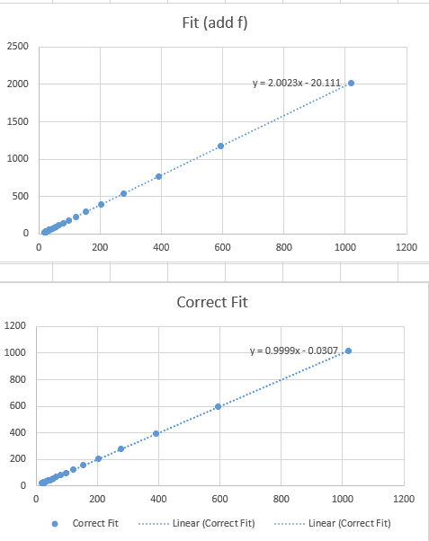
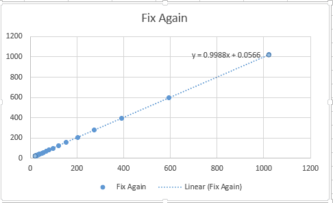
I will attach all 3 graphs with the equations. I added in a bit of random variance to the ##d_i## measurements, so they are all +/- 1cm.
I would really like to end this section by arriving at ##1/f = 1/d_o + 1/d_i##

Any ideas on adjustments that could be made, or why we can/should argue around the "add f" method?
The 3 labeled graphs are as follows:
Correct Fit = ##d_i## vs ##\frac{fd_o}{d_o-f}## which can be arranged into the standard thin lens equation.
Add f = ##d_i## vs ##\frac{1}{d_o-f} + f##
Fix again = ##d_i## vs ##\frac{1}{2}(\frac{1}{d_o-f} + 2f)## , I added f again to fix the intercept, then multiplied by 1/2 to fix the slope.
1703033149593.png

1703033263093.png

If need be, I can attach the spreadsheet.
Any ideas or suggestions are appreciated.
What I find really interesting is that the correct fit and fix again trendlines are both very convincing, although correct is objectively ever so slightly better, and over a large data range at that. Horizontal axis is fit values, vertical is simulated data with random variance.
All plots use the same data.
 
Science news on Phys.org
  • #2
BiGyElLoWhAt said:
I'm trying to come up with an intuitive way to linearize the data.
Two questions for you just to get my bearings regarding what your pedagogical goals are:
1. Have the students seen data linearization in other experiments or is this experiment the first one? In other words, do they already have an idea of what linearization is all about?
2. Is this an experiment in which the students will actually collect the data and then do the analysis or are you going to give them the data and ask them to find the underlying equation?

If the latter, I asked myself what would I do if I were presented with a list of dependent and independent variables pairs and asked to find the relationship between the two with the aid of an Excel sheet. I generated pairs ##(d_i,d_o)## using the thin lens equation and did my best to pretend that I forgot where they came from. I used ##f=20~##cm and no random variance. This how I proceeded

1. I first made a scatter plot to get an idea of what is going on (see below)
Pot_A.png


2. Clearly, there is an asymptote at 20 cm and one around 25 cm, but I pretended I didn't notice them. So I used the Excel fitting options in sequence Exponential, Linear, etc. nothing worked. Changing the linear axes to logarithmic didn't work either.

3. It dawned on me that I should consider investigating the asymptotic behavior both vertical and horizontal and plotted ##y=1/d_i## vs ##x=1/d_o##. Aha! A straight line which can be fitted by linear regression.

Plot_B.png


4. It follows from the fitted linear equation on the plot that ##\dfrac{1}{d_i}=-\dfrac{1}{d_o}+0.05.## This can be rewritten as
##\dfrac{1}{d_i}+\dfrac{1}{d_o}=0.05~(\text{cm}^1)## and it shouldn't be too hard to make the leap and wrie the constant on the right-hand side as a reciprocal, in this case ##\dfrac{1}{20~(\text{cm})}.##

I really don't see why you bother with all that stuff about the horizontal asymptote, Occam's razor, etc.
 
  • Like
Likes DeBangis21 and BiGyElLoWhAt
  • #3
There are 2 parts to the lab (2 different sessions), A) they will adjust a lens and screen to take data points. B) is intended to be both a conceptual and analytical analysis.
Most students will have never linearized data before, nor seen data be linearized. This will be the biggest/most in depth data analysis that they will do in this lab.

Conceptually, I want them to get that the asymptotes correspond to either parallel rays exiting or entering the lens (##d_o \to \inf## gives us parallel incoming rays, ##d_i \to \inf## gives us parallel outgoing rays).
Analytically, I want to A) exercise their math skills, B) introduce them to some techniques for data analysis.

I believe that you're idea of plotting 1/x vs 1/y is pretty clever.

Does that seem more obvious than saying, "This looks like 1/x, but shifted to the right and up"?
To me, the shifted graph feels more intuitive, but again, that's to me.
 
  • #4
I think I have resolved the issue. I looked closer at my formulae in excel. For the "add f" function, I went through and cleaned it up to get ##\frac{1+fd_o - f^2}{d_o-f}##. However, when plugging it into excel, I typed ##+f^2##. Doing so and adding f again (then multiplying by 1/2) gives ##\frac{1}{2(d_o-f)} + \frac{fd_o}{d_o-f}##, and the first term is always small relative to the 2nd, which is why the graphs were so close, which was the source of my confusion and frustration.

My apologies.

Now the curve for doing it with +f looks significantly different to the data.
 
  • #5
BiGyElLoWhAt said:
Conceptually, I want them to get that the asymptotes correspond to either parallel rays exiting or entering the lens (##d_o \to \inf## gives us parallel incoming rays, ##d_i \to \inf## gives us parallel outgoing rays).
Analytically, I want to A) exercise their math skills, B) introduce them to some techniques for data analysis.

I believe that you're idea of plotting 1/x vs 1/y is pretty clever.
My suggestion would be to also get the students to understand and verify that light rays can be reversed. If they perform a measurement with the source at ##d_i## of a previous measurement, the image will appear at ##d_o## of that measurement. This interchangeability of variables points to a symmetric treatment treatment of ##d_o## and ##d_i##, i.e. if you plot 1/x on one axis, you should plot 1/y on the other because the axes are interchangeable as far the underlying equation is concerned.

Thank you for your compliment but my "clever" idea follows from the symmetry of the problem.

I still do not understand what this "add f" is all about. It looks unjustified to me and will likely confuse the students.
 
  • #6
Adding f isn't the way to go about it. However, I think most students will be inclined to try that first.

I want this to have less "hand-holding" rather than more.
When you have ##1/{d_o-f}##, you have a general shape of the graph, and the correct asymptote at ##d_o = f##, however the incorrect asymptote at ##d_i = 0##. The way to adjust the function such that you get the asymptote and also the lens equation is to multiply by ##fd_o \to \frac{fd_o}{d_o-f}= d_i##. Strictly looking at the asymptotes, however, you can also add f, so ##1/(d_o-f) +f## which will give you both correct asymptotes. When making a plot of this model vs. the data, you end up with a fit that doesn't really match the data.

As far as the clever idea goes, I would be ecstatic if my students were, in general, mathematically inclined enough to understand this. Some of them will definitely get it, but some of them will almost certainly not.

I think looking at ##\lim_{d_o\to \infty} \frac{1}{d_o-f}## and trying to adjust it so that we get ##d_{i,\infty} -> f## will feel more natural, especially considering most if not all students will be fresh out of calc 1.

I think I will be more specific about some of the data points they take to include the reversibility. As of right now, there were a few points, ranging from 5cm to 30cm, along with "an additional 10-15 or more points, focusing on areas of interest" (exact wording TBD).

EDIT:
OK how do I get limit bounds under the limit?
 

FAQ: Data analysis by guessing, checking and fixing

What is "Data analysis by guessing, checking, and fixing"?

"Data analysis by guessing, checking, and fixing" refers to an informal and iterative approach to data analysis where initial hypotheses or guesses are made about the data, these guesses are then checked against the data, and any discrepancies are fixed or refined. This process is repeated until a satisfactory understanding or solution is achieved. It is often used in exploratory data analysis when formal methods are not immediately applicable.

Is "guessing, checking, and fixing" a reliable method for data analysis?

While it can be useful in the early stages of exploratory data analysis, "guessing, checking, and fixing" is not a substitute for rigorous statistical methods. It can help identify patterns and generate hypotheses, but these should be validated with more formal and robust techniques to ensure reliability and accuracy.

When should I use "guessing, checking, and fixing" in data analysis?

This method is particularly useful in the initial stages of data exploration when you are trying to understand the structure and characteristics of your data. It can also be helpful when dealing with messy or incomplete data where formal methods may be difficult to apply initially. However, it should be complemented with more rigorous analysis as you progress.

What are the risks associated with "guessing, checking, and fixing"?

The main risks include the potential for confirmation bias, where you may only see what you expect to see, and the possibility of overfitting, where your "fixes" are too closely tailored to your specific dataset and do not generalize well. Additionally, this method can lead to a lack of reproducibility and transparency if not documented properly.

How can I document my "guessing, checking, and fixing" process?

To document this process effectively, keep detailed notes of your initial guesses, the checks you perform, the results of these checks, and the fixes you implement. Use version control systems to track changes and iterations. Additionally, consider using notebooks (such as Jupyter Notebooks) to combine your code, analysis, and commentary in a single, organized document.

Similar threads

Back
Top