Distribution of satellite clusters around seed cluster in ATLAS

  • #1
kimi7335
2
1
TL;DR Summary
Why is there an increase in the number of satellite clusters for eta = 0 in the ATLAS detector?
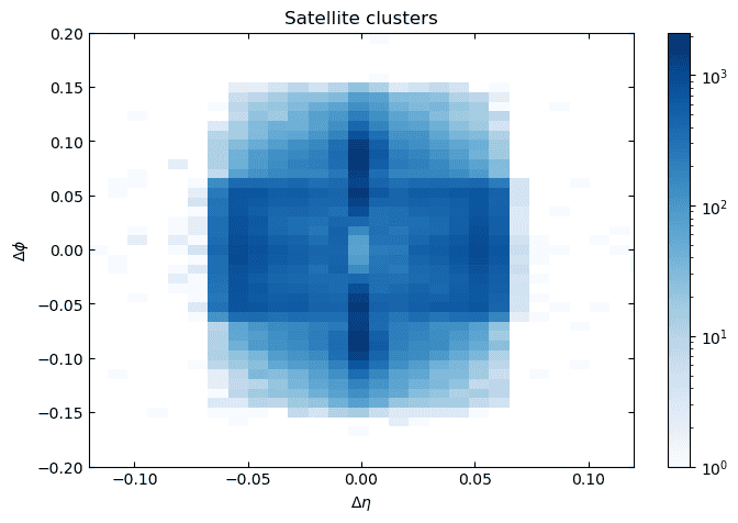
From data of proton-proton collisions at the LHC using the ATLAS detector I have plotted a heatmap of the distribution of satellite clusters (brem and converted photons) around seed clusters (electron/photon candidates without satellites) at (eta, phi) = (0,0).
The data I am using is of the order of 1 million events.
The x- and y-axes show the distance between the satellites and the seed cluster in eta (pseudorapidity) and phi (azimuth).
Why is there an increase in the number of satellites for eta = 0 above and below phi = 0?
heatmap_high_stats_data.png
 
Physics news on Phys.org
  • #2
The magnetic field bends particles in phi but not in eta. You might see bremsstrahlung from (relatively low energy) electrons. You can make this plot separately for electrons, positrons and photons to check.
 
  • Like
Likes kimi7335
  • #3
I assume this is entirely your own plot from released data, and that's why you use non-standard terms like "hearmap" and "satellite".

It might be physics, as @mfb said. Or it might be some artifact of noise, or geometry or both. Without knowing a lot more about what went into this plot, it is hard to tell.

I think it was a mistake to release the LHC data without a corresponding paid team to help people understand it. The collaborations invested many person-centuries in understanding this data, and dumping it on the public with just a hearty "good luck" seems a little mean-spirited.

What you can take away from a plot depends on what you put into it - what is your definition of electron, photon, etc. What subdetectos you are looking at. What event selection you applied. And so on.
 

Similar threads

Replies
48
Views
7K
Replies
13
Views
2K
Back
Top