Help! Old PC dog has to learn new Mac tricks

  • Thread starter DaveC426913
  • Start date
  • Tags
    Desktop
In summary, this topic addresses the challenge of adapting to a new computer system, specifically switching from a PC to a Mac. It highlights the difficulties that an older individual may face in learning new technology and provides tips and tricks for making the transition smoother. It emphasizes the importance of patience and perseverance in mastering new skills.
  • #1
DaveC426913
Gold Member
22,986
6,661
TL;DR Summary
PC user needs to learn Mac features: custom icon for a desktop shortcut (You think you know how to do it, but you don't.)
Hey! 40 years on PCs and now I'm a Mac guy, YAY!

I'm onboarding at my new job, and there's a lot of content to cover on my own recognizance. I can't be asking my boss or coworker every time I need to remember whether print screen is Ctrl-Option-Staff-of-Ra-3 or Command-Function-Sarcophagus-3. Also, no Mac friends top ask.

And, to the point: if all I had to do is Google it or find some cheat sheet, I wouldn't be here now. Generic answers simply are often dead wrong.

Here's example one I need help with:

Custom icon for desktop shortcut to webpage
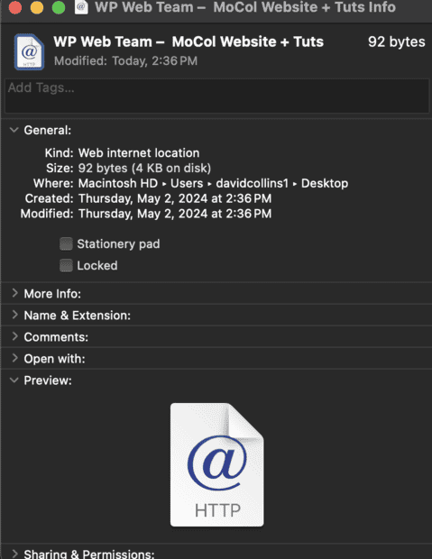
  1. I am using my desktop for important bookmarks to apps I use all the time (for example: the dashboards for CMS portals like Drupal and Wordpress into the sites I'm responsible for curating.)
  2. So, my Drupal dashboard. I want a shortcut on my desktop. I drag and drop it from my browser (Saf*cough*ari) on to my desktop. It has a hideous generic "http @" icons that means nothing to me, especially next to all the other identical ones. A meaningful icon for me would be the Drupal logo.
  3. To change the shortcut icon, I am told to "right-click" ** on the shortcut, then choose Get Info, to pull up the shortcut menu. Thern I click on the tiny icon on the upper left to change it.
LIES!

Screenshot 2024-05-02 at 3.11.41 PM.png


Many sites offer this exact solution. They are all lying. This does not work. That icon is static.

I trusted the innertoobs and they let me down.


** "right-click" translation: I have a 20% chance of getting it right first time: Shift-click? No. Fn-click? No. Command-click? No. Option-click? No. Ctrl-click? YES! Only fifth try!
 
Last edited:
  • Like
Likes BvU
Computer science news on Phys.org
  • #2
Giant Lie #2:

The Ask:
Simply make an alias on my desktop that points to a doc elsewhere
(in this case, in One Drive).

The solution:

Donning my Googles, I am told by 10 million users:

  1. Got to the Menu > File > Make Alias

LIES!


Screenshot 2024-05-02 at 5.17.01 PM.png


Make Alias is inactive.

Mac is all about these kinds of "Modes". If you are in Mode 1, nothing works the same as when you are in Mode 2. Too bad no one wants to share which Mode Make Alias works in.

:headbang::headbang::headbang:
 
  • #3
I just tried it myself.

Warning #1: I have a single-button mouse, so things like "right-click" don't work for me.
Warning #2: I'm leaving on a weekend road trip in the morning, and won't have a MacOS device with me (just my iPhone and iPad).

Anyway, I dragged a shortcut from Safari to my desktop and got the ugly "@" icon. I also used the Screenshot app to get an image (PNG) of the icon that I actually use for that page in Safari. (It's part of my own site, on which I use HTML magic to create a custom icon for it.).

I clicked on the "@" icon and hit command-I to get the info window for the shortcut.

Screenshot 2024-05-03 at 1.17.13 AM.png


Then I did the following:

1. Click on the "Screenshot" icon to select it (without opening it).
2. Hit Command-C to copy it to the clipboard.
3. Click on the info window to select it.
4. Click on the little "@" icon at the top right of the window, to select it. It now has a thin blue border around it. You'll see it in the next image.
5. Hit Command-V to paste the copied image.

Screenshot 2024-05-03 at 1.18.53 AM.png


See the blue border?

When I click on the updated icon, it takes me to the appropriate page.
 
  • #4
DaveC426913 said:
And, to the point: if all I had to do is Google it or find some cheat sheet, I wouldn't be here now. Generic answers simply are often dead wrong.

I had the same questions you have when switching from PC to Mac years ago. I googled the answers. If I were to do it right now I'd look to see if I saved the details in my folder where I keep such information. But I'd probably end up googling it again. Yes, just like with windows stuff the OS version and other factors mean that internet instructions sometimes don't apply to you. You have to search further.

I just replaced the icon for an app (not just the shortcut) a couple of days ago. But I went about that completely differently, opening the package contents and actually replacing the .icns file. How do you make an .icns file would be the next question. Google it!
 
  • #5
jtbell said:
4. Click on the little "@" icon at the top right of the window, to select it. It now has a thin blue border around it. You'll see it in the next image.
Yes, I noticed this during my experimentation. I got this far.

jtbell said:
5. Hit Command-V to paste the copied image.
:headbang: :headbang: :headbang: :headbang: :headbang: :headbang: :headbang:
How would any sane person think of this!!???

Does Mac know what the term affordance means? High affordance is a control that makes it obvious how to operate it. A doorknob has high affordance. A secret passage operated by the yanking of a nearby wall sconce has very low affordance. Like this Mac feature.


Thank you.
 
  • #6
DaveC426913 said:
How would any sane person think of this!!???
Aren't copy and paste nearly identical on Windows and Macs? I.e., CTRL-C vs Command C for copy and CTRL-V vs Command V for paste?
 
  • Like
Likes jedishrfu
  • #7
Mark44 said:
Aren't copy and paste nearly identical on Windows and Macs? I.e., CTRL-C vs Command C for copy and CTRL-V vs Command V for paste?
Yes. That's not what's inscrutable.

The idea that you can select a teeny 12x12 icon next to a window title - and a paste function would work - is highly nonintuitive. There was nothing about it that suggested it was willing to be replaced by a paste.

Imagine any of the tiny icons in this screen snippet being changeable by selecting one and pasting. It's just too far outside the scope of normalcy.
1714758000896.png


In Windows, the ability to edit an icon would likely have had its own a small, simple popup where you could paste. This may have been an inefficient use of multiplt nesting windows, but least it had a degree of affordance.
 
  • #8
DaveC426913 said:
The idea that you can select a teeny 12x12 icon next to a window title - and a paste function would work - is highly nonintuitive. There was nothing about it that suggested it was willing to be replaced by a paste.

You're absolutely right. Apple does a lot of stuff the "Apple Way" and if you don't like it you can complain about it. And people certainly do. But ultimately you're only real choice is to either live with it or switch to the other giant uncaring monolith. It's up to you.
 
  • #9
JT Smith said:
It's up to you.
Oh, sorry. Did I give the impression this was my choice? I suppose I could choose to quit my new job.:cry:
 
  • #10
DaveC426913 said:
Oh, sorry. Did I give the impression this was my choice? I suppose I could choose to quit my new job.:cry:

My bad, I glossed over that.

So continue with the complaining then. :-)

It's not like Windows is a panacea. And I'm for sure not an Apple fanboy. Once upon a time I cheered for them. I bought a small amount of their stock long ago when it looked like their chance for success was slim at best. I just wanted an alternative to Microsoft. I hated their products and despised the company. Bill Gates was Satan.

That small stock purchase, coupled with a doubling down a decade or so later, turned out to be the best investments I ever made.

Now? Apple *is* Microsoft: huge, uncaring, a corporate bully. I have an iMac and an iPhone and they work okay but I hate many of their features. And I have been steadily shedding their stock. I wish there were a small company I could bet on to be an alternative.
 
  • Like
Likes davenn and DaveC426913
  • #11
This "magic mouse" wheel user experience is just awful.

Screenshot 2024-05-07 at 12.02.44 PM.png


I spend a lot of my time gently stroking the mouse in the hopes that something on my screen will move. There's zero affordance, and more often than not, there's zero feedback, leading me to wonder if I'm stroking it hard enough. Assuming I am stroking it hard enough I then wonder if I am stroking it in the right direction - I am as likely to be at the bottom of a block of content and performing the action that makes it scroll down, rather than up. It all leads to a lot of wasted time and frustration.

Am I stuck with this "magic mouse"? Are there Mac-compatible mice that have actual wheels on them?

Update:
A little research suggests alternate Mac mice that have an actual wheel control.

I'm not yet sure if they connect directly via bluetooth or whether I still need a dongle.
 
  • #12
DaveC426913 said:
Update:
A little research suggests alternate Mac mice that have an actual wheel control.

I'm not yet sure if they connect directly via bluetooth or whether I still need a dongle.
I have a 2021 Macbook M1 Pro and use a dongle-free wheeled bluetooth Logitech 535 mouse. The mouse uses a single AA battery. I use Energizer rechargeable lithium ion batteries.
 
  • Informative
Likes berkeman
  • #13
DaveC426913 said:
This "magic mouse" wheel user experience is just awful.

View attachment 344725

I spend a lot of my time gently stroking the mouse in the hopes that something on my screen will move. There's zero affordance, and more often than not, there's zero feedback, leading me to wonder if I'm stroking it hard enough. Assuming I am stroking it hard enough I then wonder if I am stroking it in the right direction - I am as likely to be at the bottom of a block of content and performing the action that makes it scroll down, rather than up. It all leads to a lot of wasted time and frustration.

Am I stuck with this "magic mouse"? Are there Mac-compatible mice that have actual wheels on them?

Update:
A little research suggests alternate Mac mice that have an actual wheel control.

I'm not yet sure if they connect directly via bluetooth or whether I still need a dongle.

I have a Magic Mouse. It's worked flawlessly for almost 11 years. Best mouse I've owned, no question. My wife has a couple as well, both the battery type and USB charge type, and they work great too. I wonder what the problem is with yours?

There's far more to complain about in the keyboard department. Or what about Finder? Surely that's fertile ground for a rant or three.
 
  • #14
I also have had no problem with scrolling my 4-year-old Magic Mouse. When scrolling a long forum page here, I simply flick my finger across the top of the mouse a few times. When I need to move something precisely, I click and hold it, and drag the mouse.

My one big complaint about my USB-charged Magic Mouse is that I can't use it while charging. the USB charging port is on the bottom of the mouse. How did they ever come up with that stupid, hare-brained, #%$^%&*@ design??!!??!!?? o0)?:)o_O:)):wideeyed::eek:

IMG_4570.jpg
 
  • #15
jtbell said:
My one big complaint about my USB-charged Magic Mouse is that I can't use it while charging. the USB charging port is on the bottom of the mouse. How did they ever come up with that stupid, hare-brained, #%$^%&*@ design??!!??!!?? o0)?:)o_O:)):wideeyed::eek:

I feel the same way. It's why I keep my old battery version going (the contacts are getting a little finicky after nearly eleven years). I can always buy new rechargeable AA batteries but when the battery in your mouse gets old what are going to do? Open it up and replace it yourself? Or toss the whole thing in the trash and buy a new mouse?

It's another instance of Apple thinking like a seller of products instead of a user of their products.
 
  • Like
Likes davenn
  • #16
DaveC426913 said:
  1. Got to the Menu > File > Make Alias

LIES!
It's context sensitive. You click on the icon of the file in the window and 'make alias is visible'
DaveC426913 said:
This "magic mouse" wheel user experience is just awful.
I use the magic touchpad - or the touchpad on the Macbook Pro. They are both big enough and with good enough dynamics to swipe wherever you want on (more than one) screen. I never have room for a mouse amongst the coffee, books etc. and definitely on my lap (which is handy for a laptop). It's true that the touchpads I have tried on PCs tend to be lumpy.

If the OP wasn't given the job of software developer then very few of these problems would actually apply. That's often why companies and creatives use Apple; they don't want to know about nuts, bolts and registers.
 
  • #17
sophiecentaur said:
I use the magic touchpad - or the touchpad on the Macbook Pro. They are both big enough and with good enough dynamics to swipe wherever you want on (more than one) screen. I never have room for a mouse...

It's funny but I feel like a mouse is more space efficient than a touchpad (unless it's built into a notebook of course). I barely move my mouse left/right, up/down. Maybe 1-2cm max. It's easy to cover the screen. If I were really pressed for space I could rest it on my thigh. It works fine there.

Maybe you should clean up your desk! :-)
 
  • #18
JT Smith said:
I barely move my mouse left/right, up/down.
And, of course the gestures on the trackpad (same as you use on your phone, with one, two and three fingures used) are brilliant. for years I have thought that the mouse should be well on the way out but I see people fumbling around to find the mouse each time they need it (track pad just sits there there) and rattling around, bashing it on the desk.

I have limited experience of the 'best' of modern mouse control so I may have missed out but my pad is a joy.

The transition is not easy , though. Just go with the flow and don't insist on doing things your way.
 
  • #19
As as far as I know you can't do pinch zooms with a mouse. But right button context menus are easier to activate than on a pad, or at least I think so. Mostly it comes to what you're used to. When I occasionally use a pad on a notebook I find them awkward and slow. Probably I just don't use them correctly.

Also I'm old school in that I use the keyboard for a lot of things that people use mice or pads for. I find I'm more efficient with keyboard controls, perhaps because that's how I grew up on computers. It's funny, a friend of mine says younger colleagues are sometimes amazed when she types without looking at the keyboard. Like it's a magic trick. Touch typing is a thing from the past that she does effortlessly. Me too. But neither of us can do that two thumb thing with our phones with any rapidity.

I wonder what our computer experience will be like in twenty-five years?
 
  • #20
JT Smith said:
Touch typing is a thing from the past that she does effortlessly. Me too. But neither of us can do that two thumb thing with our phones with any rapidity.
That really dates us. Kids in school used to do it under the desk and it was very hard to spot.

Twenty Five?? I wish. :smile:
 
  • #21
DaveC426913 said:
TL;DR Summary: PC user needs to learn Mac features: custom icon for a desktop shortcut (You think you know how to do it, but you don't.)

  1. To change the shortcut icon, I am told to "right-click" ** on the shortcut, then choose Get Info, to pull up the shortcut menu. Thern I click on the tiny icon on the upper left to change it.
LIES!
When you say "click on" you should paste into the selected icon, top right of the info box, in the normal cmd.V. It works pretty reliably - especially if you download all those available icons.

I remember the old folk who struggled with that new decimal money that they introduced in 1972. Things can be hard. :smile:
I just saw a greater spotted woodpecker in the garden. It was having a go at the new telegraph pole - no luck there pal.
 
  • #22
< rant >
I'm going to rage quit my new job for no other reason than because I have to use a Mac. What a horrible user experience this is.

I am going to write an open letter to Apple to tell them to implement three philosophies in their infernal devices:

1. If I tell you to do something, do it.
  • If I right-click on a control to bring up its context menu, then you bloody well bring up its context menu. Now. Don't wait for me to click two or three times to make sure I really meant it.
  • If I hit the bottom of the screen where the task bar is, then you bloody well bring up the task bar. Now. Don't wait three or four seconds to make sure I really meant it. (Particularly aggravating, considering you have no such compunctions about instantly flying out the damned bookmarks bar if I go within a quarter statute mile of the left edge of the screen).
  • If I stroke your stupid horrible magic mouse back - because that's how you make me scroll - then you bloody well better scroll. And if you can't do that then it is a crap product that does not work.
2. If I don't tell you to do something, don't do it.
  • Don't helpfully scroll up and down all over the screen when I didn't ask you to.
  • I clicked on the desktop, that's all. I did not ask you to send every single window I've been working on flying off the page into oblivion.
3. Learn the concept of affordance!
  • The stop light controls make zero sense. They don't represent what they do, and what they do is inconsistent. Sometimes the yellow light changes the window size, sometimes it makes it go away completely. Same with the green light. The red light seems to do the same - it doesn't actually quit the application or anything; you can still see it operating in the background if you look at the task bar. I spend an inordinate amount of time telling my computer that, when I want to quit an application, I mean I want to quit it. (See item 1, above).
  • Also, if you're going to provide a helpful popup telling me what the green light will do, you do suppose you could finish the job and so the same with the other buttons?
    Popup (green light):
    Screenshot 2024-05-24 at 2.54.35 PM.png


    No popup (red, yellow light):
    Screenshot 2024-05-24 at 2.55.54 PM.png


My job is hard enough to learn without spending every second of my time fighting the tool that's supposed to be an invisible interface to my work.

I am beginning to throw things. Expensive things. When I am more calm, l will check to see if my Bluetooth headphones survived their encounter with the steel door jamb.

My mouse - like my cell phone - now has deeply-embedded teethmarks. There are very few things in the world that can drive me into a rage where I try to bite them in half, but this mouse has expanded my list to two.

Thanks for listening.

< /rant >
 
Last edited:
  • Haha
  • Like
Likes davenn, symbolipoint, OmCheeto and 1 other person
  • #23
I only laugh, as I only just switched from windows to mac, (google, google, google), 17 years ago, and I can still relate to your frustration.
 
  • Like
Likes berkeman
  • #24
The red button means "Close this window". Some programs used to live in one window and quit when you close it. Most don't do that. For quitting, the most reliable thing is command q. (The square flower is command.) The yellow button means "hide the window in the dock".

Forget that Apple mouse. I use a $12 wired one from Menards. It has extra buttons on the sides that you can use for various things. No new software needed. (Don't by fancy Razer mice, they look nice, but their software got stupid.)

DaveC426913 said:
I did not ask you to send every single window I've been working on flying off the page into oblivion.
You can turn that off in system settings / Desktop & Dock / "Click wallpaper to reveal desktop". The idea is that the window clear out so that you can see all your desktop icons, and then come back if you click again, or drag an icon to a program in the dock.

======
BTW, are you using a spinning hard drive? Apple has recently gotten dumb with those, and so they should only be used for backups or rarely used files. The pauses you are experiencing might be from hard drives spinning up and down for no reason.
 
  • #25
JT Smith said:
I find I'm more efficient with keyboard controls, perhaps because that's how I grew up on computers.
IMHO, keyboard commands are for features you use multiple times a day, while menus and buttons are for the less common things.
 
  • #26
OmCheeto said:
(google, google, google)
I'm in a phase where it's less about "how do I do X on a Mac" and more about "just do what I ask so I can get some work done".
Algr said:
The red button means "Close this window". Some programs used to live in one window and quit when you close it. Most don't do that.
So, antiquated purpose. Good to know.

Algr said:
For quitting, the most reliable thing is command q. (The square flower is command.) The yellow button means "hide the window in the dock".
Yeah. Keystrokes have a learning curve.

Algr said:
Forget that Apple mouse. I use a $12 wired one from Menards. It has extra buttons on the sides that you can use for various things. No new software needed. (Don't by fancy Razer mice, they look nice, but their software got stupid.)
Yep. I bought a $19 Amazon one with a wheel and 2 buttons.
Algr said:
You can turn that off in system settings / Desktop & Dock / "Click wallpaper to reveal desktop". The idea is that the window clear out so that you can see all your desktop icons, and then come back if you click again, or drag an icon to a program in the dock.
I wonder if I'm the first person to wish for an all-in-one "Emulate a PC" setting.

Algr said:
======
BTW, are you using a spinning hard drive? Apple has recently gotten dumb with those, and so they should only be used for backups or rarely used files. The pauses you are experiencing might be from hard drives spinning up and down for no reason.
Dunno. I'll check.
 
  • Like
Likes davenn and PhDeezNutz
  • #27
DaveC426913 said:
I wonder if I'm the first person to wish for an all-in-one "Emulate a PC" setting.

I doubt it. I certainly had a lot of that when I first got a Mac. I hated the fact that I couldn't open multiple instances of the same application. Was frustrated with the way Finder would sort things, hide extensions, and even hide entire folders. I spent some time working out how to mute the startup sound. I even hooked up my old IBM Model M keyboard which required a powered PS/2 to USB adapter as well as software to remap certain keys.

But after a while it's all the same, more or less. It's never exactly the way you want it to work. Probably if I went back to Windows I'd try and make it work more like my Mac.


I think you actually can run Windows on Mac hardware but that's not quite the same thing.
 
  • #28
JT Smith said:
I hated the fact that I couldn't open multiple instances of the same application.

As a Mac user, this struck me as being a really bad idea when I first heard about it. Isn't this asking for data corruption when the two instances incorrectly wrote into each other's files? I still don't remember what is achieved by doing this?
JT Smith said:
I spent some time working out how to mute the startup sound.

Set the system volume to max, and then turn down your speakers or amp. This won't mute the startup sound, but will make it comparatively quieter. My current mac always plays it through the built in speaker anyway, but I do recall one of my older ones having a jarring levels issue.

JT Smith said:
I think you actually can run Windows on Mac hardware but that's not quite the same thing.

The old Intel macs let you install windows like it was any other computer. The new ones use emulation, but it still works okay, I hear. (I've never done this.)
 
  • #29
Algr said:
As a Mac user, this struck me as being a really bad idea when I first heard about it. Isn't this asking for data corruption when the two instances incorrectly wrote into each other's files? I still don't remember what is achieved by doing this?

What do you mean by "each others' files"?

Say you have Word and Adobe Acrobat, and File 1 and File 2.
You can open File 1 in Word and File 2 in Acrobat.
Why can't you open File 1 in Word[1] and File 2 in Word[2]?

Say you try to open File 1 in Word[1] and in Word[2] simultaneously.
How is that any different from trying to open File 1 in Word and in Acrobat simultaneously?

There is a failsafe already in-place to prevent clobbering of data in this case. When any file is opened in edit mode it is locked from being edited by any other application.
 
  • #30
Algr said:
As a Mac user, this struck me as being a really bad idea when I first heard about it. Isn't this asking for data corruption when the two instances incorrectly wrote into each other's files? I still don't remember what is achieved by doing this?

Even with a Mac you can have two separate apps open the same file. But typically one wouldn't do this with the same app so it's a red herring. There is a difference between having a tab and an instance of an app. If you don't appreciate that difference it's possibly because you haven't experienced it.

The other day a friend wanted to log into two different gmail accounts on her iPhone via her Chrome browser. She couldn't do it. I suggested she open the second one in Safari. Then it worked. But if she could have simply opened a second instance of Chrome she wouldn't have needed Safari. That's probably not the best example though.


Algr said:
Set the system volume to max, and then turn down your speakers or amp. This won't mute the startup sound, but will make it comparatively quieter. My current mac always plays it through the built in speaker anyway, but I do recall one of my older ones having a jarring levels issue.

I wrote a script that saved the volume in an unused NVRAM location and then muted the volume. That script was linked to logging out. Another script, which ran when I logged in, retrieved the value from NVRAM and set the volume. Or something like that. I figured this out, with a lot of help from the internet, about a decade ago. I guess it still works or maybe Apple got rid of that stupid sound. I haven't heard it in years. I don't remember this being an issue with Windows.

It's a small thing but it set the stage for a growing dislike of Apple. Just recently I was considering buying an Apple watch. But apparently transfering the data from the watch to my iMac is not simple. Why not?? Answer: Apple.
 
  • #31
Algr said:
Isn't this asking for data corruption when the two instances incorrectly wrote into each other's files?
PCs could do this since the mid-1980's.

Indeed, you could even lock part of a file - two people could update the same database, provided a) the application supported this, and b) they weren't trying to update the exact same thing. But Bob could update one customer's address at the same time Mary was updating another.
 
  • #32
JT Smith said:
Even with a Mac you can have two separate apps open the same file. But typically one wouldn't do this with the same app so it's a red herring. There is a difference between having a tab and an instance of an app. If you don't appreciate that difference it's possibly because you haven't experienced it.

Yes, I don't know what "Tab" means in this case. I use tabs regularly in web browsing, but I am recalling this from pre-internet days. I'm describing the opposite situation: A program open twice on a single machine, presumably working on two different files.

My issue was that if a program, (for example a word processor) was designed to open multiple documents at once, why would you instead open multiple instances of the program? What is the benefit? The cost is that it seems dangerous to rely on windows not to confuse two programs with identical names and code, by giving files aimed at one to the other. For example getting their scratch files or working data mixed up, thus randomly merging parts of two files.

Another problem I could forsee is things not working due to the user not realizing that they have two different instances of an application open. For example trying to use the "clone" tool in an art program from one document to another. If the tool bars are on top of each other, then the user would have no idea why the clone tool was not working. If they were in different places, remembering what identical window went to what document would be an interface nightmare.

JT Smith said:
The other day a friend wanted to log into two different gmail accounts on her iPhone via her Chrome browser. She couldn't do it. I suggested she open the second one in Safari. Then it worked. But if she could have simply opened a second instance of Chrome she wouldn't have needed Safari. That's probably not the best example though.
That's the only example of it being useful I've heard. It's based on a limitation of the program. I use multiple browsers like this. Having different browser icons makes it easier to understand where I am at at a given moment.
 
  • #33
Algr said:
I'm describing the opposite situation: A program open twice on a single machine, presumably working on two different files.
Yes, that's what we're discussing.

Algr said:
My issue was that if a program, (for example a word processor) was designed to open multiple documents at once, why would you instead open multiple instances of the program?
Hang on.

1. It was not granted that we were talking about a program that is designed to open multiple documents at once. We were really just talking about programs of which multiple instances can be run.

2. Even if we were, it's not like developers just never thought of what might happen if they allowed this functionality. Programs that can run in multiple instances are designed to play well with others; they keep to their own sandboxes.


Algr said:
The cost is that it seems dangerous to rely on windows not to confuse two programs with identical names and code, by giving files aimed at one to the other. For example getting their scratch files or working data mixed up, thus randomly merging parts of two files.
Sure - if they were designed badly and buggy. And the same can be said for tabbed programs where multiple files are opened by one app: if it's not designed to handle that usage, it will break!


Algr said:
Another problem I could forsee is things not working due to the user not realizing that they have two different instances of an application open. For example trying to use the "clone" tool in an art program from one document to another. If the tool bars are on top of each other, then the user would have no idea why the clone tool was not working. If they were in different places, remembering what identical window went to what document would be an interface nightmare.
This is entirely subjective - a matter of what the user is familiar with.

If a user comes from an environment where one file = one app, then they will be comfortable with tabbing through multiple fully-functional instances of the same app. But they will be flummoxed by the tab structure of multiple files = one app.

If a user comes from an environment with a tab structure and multiple files = one app, then they will be comfortable with tabbing within a single app. But they will be flummoxed by the multi structure of one file = one app.

In other words - to mangle a loose analogy: PC users are as mystified by the illogic of the Mac paradigm** as much as Mac users are mystified by the illogic of the PC paradigm.

**thus, the very raison d'etre of this thread.

Algr said:
That's the only example of it being useful I've heard. It's based on a limitation of the program. I use multiple browsers like this. Having different browser icons makes it easier to understand where I am at at a given moment.
Simply because you're used to that paradigm.

I still find myself robotically alt-tabbing between different facets of my project, forgetting that all the facets are not separate apps, but just different tabs within my browser (Is there even a kb-combo that lets you cycle between browser tabs? Maybe...).
 
  • #34
DaveC426913 said:
I still find myself robotically alt-tabbing between different facets of my project, forgetting that all the facets are not separate apps, but just different tabs within my browser (Is there even a kb-combo that lets you cycle between browser tabs? Maybe...).

If you're talking about a Mac it's command-tab that shifts focus between all of the apps and tabs that are open. If you just want to cycle through the tabs of a particular app it's command-`. I can't remember the keyboard shortcuts for Windows.
 
  • #35
There is still much confusion about interface vs. instance. If I open two files in FriendlyWare, whether I switch between tabs or windows is a question of interface. That is largely independent from whether I am running two instances of FriendlyWare or not.

Depending on how the OS and the application handle thing, I could be running one or two, irrespective of whether it is a window or tab that is used. Further, even if I am running two instances, they may share the (presumably static) code in memory as I do this. Computers could do this at least as far back as the 1970's.
 
  • Like
Likes DaveC426913

Similar threads

Replies
2
Views
2K
Back
Top