Large Scale Data Collection

  • B
  • Thread starter OmCheeto
  • Start date
  • #1
OmCheeto
Gold Member
2,422
3,102
TL;DR Summary
Oddly linear statistics in health outcomes data collection
I've been entertaining myself since my retirement with science and maths problems.
My latest endeavor's plot seems a bit too linear, and I was curious if others have had such experiences with ongoing national level data collection?:

The U.S. CDC posts death data for Flu, Pneumonia, and Covid-19 on a weekly basis.
Each week, the posted data for all weeks changes.
Most annoying is the fact that I didn't start collecting the data delay until about 4 weeks ago.
Most interestingly is that, as I mentioned previously, the data delay collection, graphed logarithmically, is exquisitely linear.
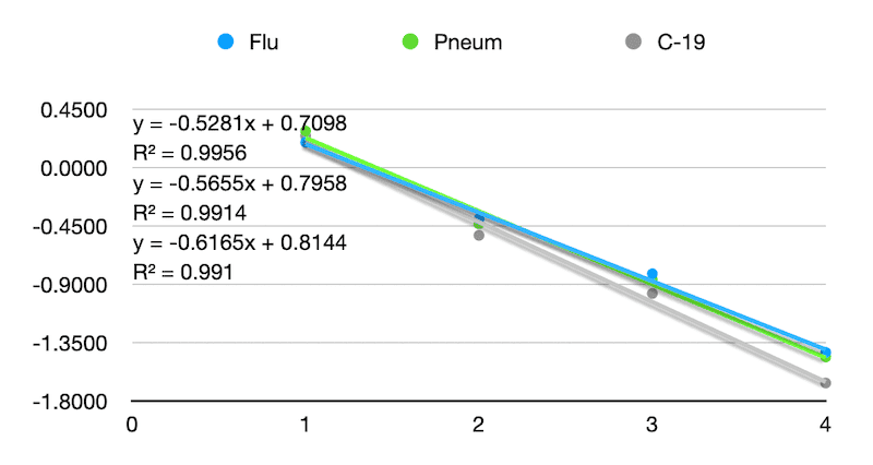
logarithmic linearity.t 2024-04-21 at 14.16.53.png


Raw data:

Lag WeekGraphical WeekWeekweek endingFluPneumC-19FluPneumC-19FluPneumC-19FluPneumC-19FluPneumC-19multmultmultmult
latestdatacollectedlastweeksdata2weeks ago3 weeksago4weeksago4321lag
063113/16/20243033,45998247442923,34396145962633041887419121625277553498118118635616602.85781.35621.13191.0322
162103/9/20243843,6441,04750753793,5921,030500136834871002485734231939334468285249774835302.56781.40281.15211.0377Flu
26193/2/20243823,8681,22154713813,8481,21554443743797119853693653698116452273203292103646482.91651.36881.13751.0347Pneum
36082/24/20243993,8171,27154873973,7891,26954553943744125553933883686123453083663512119050682.75841.30071.10711.0219C-19
 
Physics news on Phys.org
  • #2
Those numbers get tangled up in politics. The CDC just collects the data from the states. I'm not clear on what you are collecting, but I looked at delayed COVID-19 death reporting from Florida (and some other states) for a couple of years. It varies from state to state. Florida always reported very low numbers for the more recent days compared to other states, but the cumulative totals remained high. Florida's recent day reports never came close to adding up to the totals. The effect was that Florida always looked as though they were handling COVID very well and had driven the death rates comparatively very low. But if you look at the cumulative totals, you can't help but notice that they actually did poorly. They are currently the seventh worst state per capita. On a day-by-day basis, Florida would report less than one tenth the deaths of states like Texas and California, but Florida's cumulative totals did not reflect that. I once tried to determine how long Florida delayed before adding the deaths. I could not determine a pattern in when they adjusted the past data.

I never noticed anything similar for the other states. If you are analyzing death report delays, you might want to exclude the Florida COVID-19 numbers or treat them separately. I did not look at flu or pneumonia.
 
  • #4
I am shocked. And the governor an erstwhile candidate to be POTUS. Shocked, I say..
 
  • Haha
  • Like
Likes OmCheeto and FactChecker
  • #5
jedishrfu said:
While they found no impropriety, how Florida reports is still suspect.
Yes. For well over a year, any time you looked at the latest week or two (or month) of Florida's COVID-19 data, it looked like COVID had been drastically reduced in Florida and they were doing much better than other states. IMO, that was a political trick. As the deaths were slowly added in to the old daily numbers, the cumulative total told the truth. In fact, Florida is the 7th worst state in COVID-19 per-capita deaths.
 
  • #6
FactChecker said:
I'm not clear on what you are collecting
Data, on a weekly basis.

But that's not the problem. The problem is that the weekly updates change all values back to the beginning of data collection for the current flu season.

The solution I was looking for was; Given a value posted on Fridays, what will be the ultimate correct value, when all is said and done.

And that's when after my analysis I noticed the nearly perfect linear logarithmic solution.
 
  • #7
OmCheeto said:
Data, on a weekly basis.

But that's not the problem. The problem is that the weekly updates change all values back to the beginning of data collection for the current flu season.

The solution I was looking for was; Given a value posted on Fridays, what will be the ultimate correct value, when all is said and done.
Determining the "ultimate correct value" may be asking too much. When data is being recorded, there are delays and several errors that are made. Some are found and corrected. Others are not. I do not know if the CDC ever corrects whatever data source you are using. Do they only accept revised data from states? I do know that later analysis tends to estimate that there is a large percentage of under-reporting, as much as 25%. One problem with the records system is that there is often an entry for "Immediate Cause of Death" and another for "Underlying Cause". How those are initially interpreted and recorded versus later interpreted and used can be a problem.
 
  • #8
FactChecker said:
Determining the "ultimate correct value" may be asking too much. When data is being recorded, there are delays and several errors that are made. Some are found and corrected. Others are not. I do not know if the CDC ever corrects whatever data source you are using. Do they only accept revised data from states? I do know that later analysis tends to estimate that there is a large percentage of under-reporting, as much as 25%. One problem with the records system is that there is often an entry for "Immediate Cause of Death" and another for "Underlying Cause". How those are initially interpreted and recorded versus later interpreted and used can be a problem.
How about "ultimate best fit"?

Looking back now at my OP, I'm fairly certain that in a year from now, I will have no idea what the hell I was talking about. So I'll focus on Pneumonia data, and try and explain what I'm seeing:

The CDC posts this data every Friday.

On 3/22, the CDC posted that 1186 people died of pneumonia during week 11.
On 3/29, the CDC posted that 2527 people died of pneumonia during week 11.
On 4/5, the CDC posted that 3041 people died of pneumonia during week 11.
On 4/12, the CDC posted that 3343 people died of pneumonia during week 11.
On 4/19, the CDC posted that 3459 people died of pneumonia during week 11.

Plotting the posted deaths by date yields a curve.
1713916713299.png

Beings that I'm somewhat mathematically illiterate, I asked my spreadsheet for polynomial and logarithmic fits. I was not impressed.
So I evaluated the change from week to week on a log scale, and, as I mentioned, it came out very linear.

week lag01234
deaths3,4593,343304125271186
multiplier2.91.371.141.035
%191.7%36.9%13.7%3.5%
log10(%)0.28-0.43-0.86-1.46

My multiplier here is a bit cattywampus, as it goes backwards.
The multiplier of week lag 1 is deaths from week 0 divided by deaths from week 4
and
The multiplier of week lag 2 is deaths from week 0 divided by deaths from week 3

The multiplier vs lag yielded another wonky curve, so I converted the multiplier to % change and .... JOILA!

1713919217439.png


The 'week lag' vs 'log10(%)' curve was exquisite.

50 states feeding data from a million doctors through a myriad of number crunchers.
 
  • #9
I think that your result makes sense.
Suppose that each week, the errors remaining that week are a certain proportion of the remaining errors from the prior week. That is a reasonable assumption to make for your problem. The errors are the deaths that week which were not included in the death count.
Let ##e_n## denote the errors remaining after week ##n##. Let ##p## be the fractional portion of errors that will remain after one week. Start with ##e_0## = the deaths that were not reported on week 0. Then
##e_1 = p e_0##
##e_2 = p e_1 = p (p e_0) = p^2 e_0##
##e_3 = p e_2 = p (p^2 e_0) = p^3 e_0##
...
##e_n = p e_{n-1} = p (p^{n-1} e_0) = p^n e_0##

Taking the logarithm gives you ##\log( e_n) = n \log(p) +\log(e_0)##, which is linear in ##n## with a slope ##\log(p)##.
Since ##p \lt 1##, ##\log(p) \lt 0##.
 
Last edited:
  • Like
Likes OmCheeto
  • #10
Week 7 and the pattern is still there:

Screenshot 2024-05-16 at 14.03.33.png
 
  • Like
Likes FactChecker
Back
Top