Thread List View: Expand Width to Show 4 Figures After Replies & Views

  • Suggestion
  • Thread starter Wrichik Basu
  • Start date
In summary: Incognito tab to make sure that none of the extensions are causing an issue. Interestingly, it's the same as what I had reported in the OP. Maybe this is a Chrome-specific thing?No, changing zoom has no effect. I'm using Firefox on Windows 10 and it looks different to yours.
  • #1
Wrichik Basu
Science Advisor
Insights Author
Gold Member
2,138
2,713
My laptop screen is 1366 × 768 (16:9).

In the list of threads under each forum, I can see that after "Replies", at most two characters are displayed, after which the characters are wrapped to the next line. Next to "Views", three characters are shown, after which the line is wrapped. I know this varies based on the size of the screen; hence I have mentioned the size of my screen. See the image below.
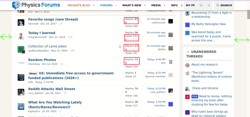
PF_screenshot1.png

On my screen, I can see there is some space to the extreme left and right, as marked with green arrows in the above figure.

Is it possible to somehow increase the width of the thread list view so that more characters can be displayed after "Replies" and "Views"? This is not something I can't live without, so this is just a gentle suggestion. A user script (running on TamperMonkey) that can make the changes locally on my browser will also be enough.
 
  • Informative
Likes Greg Bernhardt
Physics news on Phys.org
  • #2
Wrichik Basu said:
Is it possible to somehow increase the width of the thread list view
Does screen zoom change anything?
 
  • #3
anorlunda said:
Does screen zoom change anything?
I use the default 100% zoom. Increasing (decreasing) it reduces (increases) the space at the extreme left and right, but the number of characters after "Replies" and "Views" remains the same.
 
  • #4
Wrichik Basu said:
My laptop screen is 1366 × 768
Should this work for 1280x720? 1024x768? 800x600? 640x480? Where do you draw the line?
 
  • #5
Vanadium 50 said:
Should this work for 1280x720? 1024x768? 800x600? 640x480? Where do you draw the line?
That's why I said that this is a gentle suggestion, and even a user script will be enough.
 
  • Like
Likes Greg Bernhardt
  • #6
I can't reproduce this with any width of browser window (from about 640 to 1600) or any browser zoom level. My only suggestion is that it might be a problem with the "size of text, apps and other items" Windows setting (mine is 100% on the Display settings under Windows 10).
 
  • Like
Likes mfb
  • #7
DrGreg said:
I can't reproduce this with any width of browser window (from about 640 to 1600) or any browser zoom level. My only suggestion is that it might be a problem with the "size of text, apps and other items" Windows setting (mine is 100% on the Display settings under Windows 10).
Maybe, but I am not sure. I am on Chrome on Ubuntu. If I change the font size in Chrome (which is Medium (recommended) by default), the browser fonts change, but nothing changes on PF.
 
  • #8
Wrichik Basu said:
Maybe, but I am not sure. I am on Chrome on Ubuntu. If I change the font size in Chrome (which is Medium (recommended) by default), the browser fonts change, but nothing changes on PF.
I'm not familiar with Ubuntu, but the setting I was talking about is a Windows-wide setting (not a browser setting) which is typically used on screens that have a high dpi resolution.
 
  • #9
DrGreg said:
I'm not familiar with Ubuntu, but the setting I was talking about is a Windows-wide setting (not a browser setting) which is typically used on screens that have a high dpi resolution.
Yeah, I know about that setting. Couldn't find anything similar in Gnome Settings, though.
 
  • #10
Under display settings, this parameter causes a lot of trouble if not 100%

1661557843053.png
 
  • Like
Likes DaveC426913
  • #11
anorlunda said:
Under display settings, this parameter causes a lot of trouble if not 100%

View attachment 313302
On Ubuntu, I don't even have that setting. This is what is available under Display:

1661591016191.png
 
  • #12
Does it work if you change the zoom setting in the browser?

I can't reproduce the problem with any zoom setting and any browser width. I don't have Ubuntu to test.
 
  • #13
mfb said:
Does it work if you change the zoom setting in the browser?

I can't reproduce the problem with any zoom setting and any browser width. I don't have Ubuntu to test.
No, changing zoom has no effect.

Wait, this getting weird. In Firefox, I see something else:

1661605113210.png


Comparing with what I see in Chrome, the characters after "Replies" and "Views" do not break in the middle. But there is still some space to the left and right. Is this what others are seeing?

I also opened PF in an Incognito tab to make sure that none of the extensions are causing an issue. Interestingly, it's the same as what I had reported in the OP. Maybe this is a Chrome-specific thing?
 
  • #14
I'm using Firefox on Windows 10 and it looks different to yours.

1661609794452.png

It might be that Ubuntu fonts are different from Windows fonts. For one thing, the inter-character spacing looks different.
 
  • #15
I wonder how the width of the column is specified? Is it measured in pixels or points? Maybe it should be measured in ems instead?
 
  • #16
Wrichik Basu said:
I also opened PF in an Incognito tab to make sure that none of the extensions are causing an issue. Interestingly, it's the same as what I had reported in the OP. Maybe this is a Chrome-specific thing?
It might be a WebKit-specific thing. I see the same sort of wrapping you do when I use Brave (Chrome w/o all the Google-specific stuff) and Safari, but Firefox wraps the entire number when it won't fit in the column, rather than breaking it in the middle.
 
  • Like
Likes Wrichik Basu
  • #17
I have a 1920x1080 screen (same ratio as in the OP) and am running Firefox on Debian Linux.
1661617619284.png

Although this doesn't use the whole width of the screen I'm not seeing the strange wrapping effects you are.
 
  • #18
...although I note I can fiddle with settings to duplicate your Firefox behaviour:
1661618260322.png

In this case, I went into Settings -> General and in the "Fonts and Colours" section clicked Advanced..., then unticked the "Allow pages to choose their own fonts, instead of your selections above" tickbox. Are you forcing font and font size?
 
Last edited:
  • Like
Likes DrGreg
  • #19
Ibix said:
...although I note I can fiddle with settings to duplicate your Firefox behaviour:
I don't think that bothers him so much as Chrome putting a line break in the middle of a number.
 
  • Like
Likes Wrichik Basu
  • #20
vela said:
I don't think that bothers him so much as Chrome putting a line break in the middle of a number.
Indeed, but I don't have Chrome installed to play with. Maybe his Chrome behaviour is similar in origin to his Firefox behaviour, which I can replicate by forcing my system's default font choices to override PF's.
 
  • #21
Ibix said:
Are you forcing font and font size?
In Chrome, changing the font size has no effect on the font size in PF.
 
  • Like
Likes Ibix
  • #22
Wrichik Basu said:
In Chrome, changing the font size has no effect on the font size in PF.
Your screen shots show a "fixed font" whereas the rest of us are displaying a "variable font".

The "fixed" font uses the the same character spacing for all characters regardless of how wide the character is.

A "variable" font bases the spacing on the space needed to separate each individual character. For instance the letter "i" takes less space on a line than an "M" does. (note the distance between the enclosing quote marks in that sentence)

If these lines are the same length, you are displaying a "fixed" font; 15 characters each:
"IIIIIIIIIIIIIII"
"MMMMMMMMMMMMMM"
On my screeen the "I" line measures 0.95 inches.
The "M" line measures 2.4 inches. (screen pitch 102dpi, 2.54mm per pixel))

Me thinks your browser is getting confused; calculating for a variable font then having to re-do because there is not room for the fixed font. :frown:
 
  • #23
Tom.G said:
If these lines are the same length, you are displaying a "fixed" font; 15 characters each:
This is what I am seeing on Chrome:

1661673009325.png
 
  • #24
Well, so much for that 'solution'!

I was pretty sure I spotted a fixed font in the OP; but I can't find it now. ☹️

Sorry for the dead-end.

Cheers,
Tom
 

FAQ: Thread List View: Expand Width to Show 4 Figures After Replies & Views

What is a thread list view?

A thread list view is a way of organizing and displaying a list of threads or discussions on a forum or message board. It typically shows the title of the thread, the number of replies, and the number of views for each thread.

What does "Expand Width to Show 4 Figures After Replies & Views" mean?

This means that the width of the thread list view will be expanded to accommodate four digits for the number of replies and views. For example, if a thread has 1,000 replies and 10,000 views, the width will be expanded to show all four digits (1000 and 10000) instead of cutting off the numbers.

Why is it important to expand the width to show 4 figures?

Expanding the width to show 4 figures ensures that all numbers are displayed accurately and not cut off or truncated. This allows for a more precise understanding of the popularity and engagement of each thread.

Can the number of figures be customized in the thread list view?

Yes, the number of figures can be customized based on the specific needs and preferences of the forum or message board. Some may choose to show only 3 figures, while others may choose to show more than 4 figures.

Are there any drawbacks to expanding the width to show 4 figures?

One potential drawback is that it may take up more space on the screen, especially if there are multiple columns in the thread list view. This could make it more difficult to view the entire list of threads at once. However, this can be mitigated by adjusting the overall layout and design of the thread list view.

Back
Top